Turning a garage door spring into a fast, memorable service brand.
A bold badge identity for a Las Vegas garage door spring replacement company – transforming a purely mechanical component into a recognizable service mark.
Concept
Twisted SpringZ is a service company specializing in replacing broken garage door springs – a common mechanical issue in residential garage systems across the United States.
The goal was to create a bold, recognizable identity for a business that operates in a highly functional, service-driven environment.
Rather than relying on generic service branding, the identity focuses on turning the core mechanical component of the business – the spring – into a memorable visual symbol.
Client: Twisted SpringZ Location: Las Vegas, USA Industry: Garage Door Service
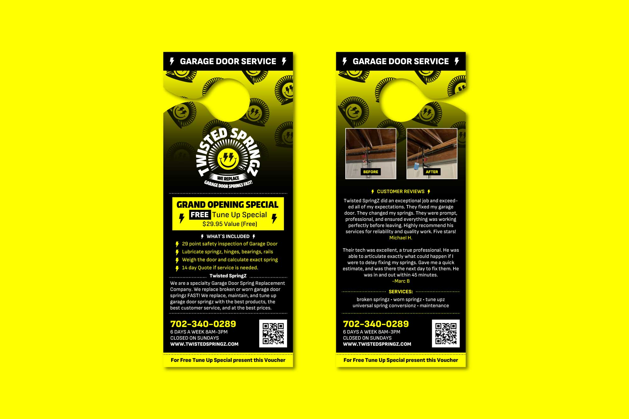
Service: Logo & Visual Identity Design Marketing Materials (Door Hangers)
Scope: Brand Identity Concept Logo Design Badge System Development
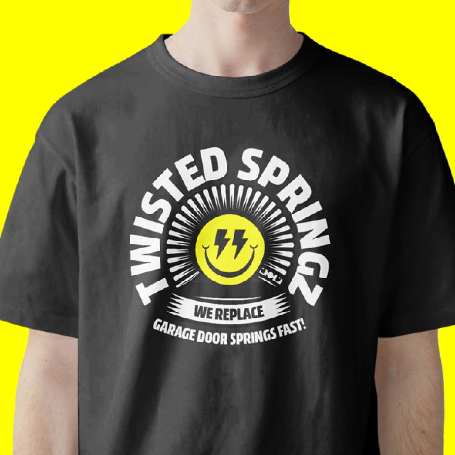
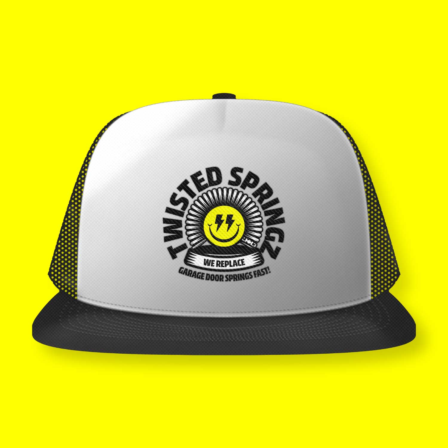
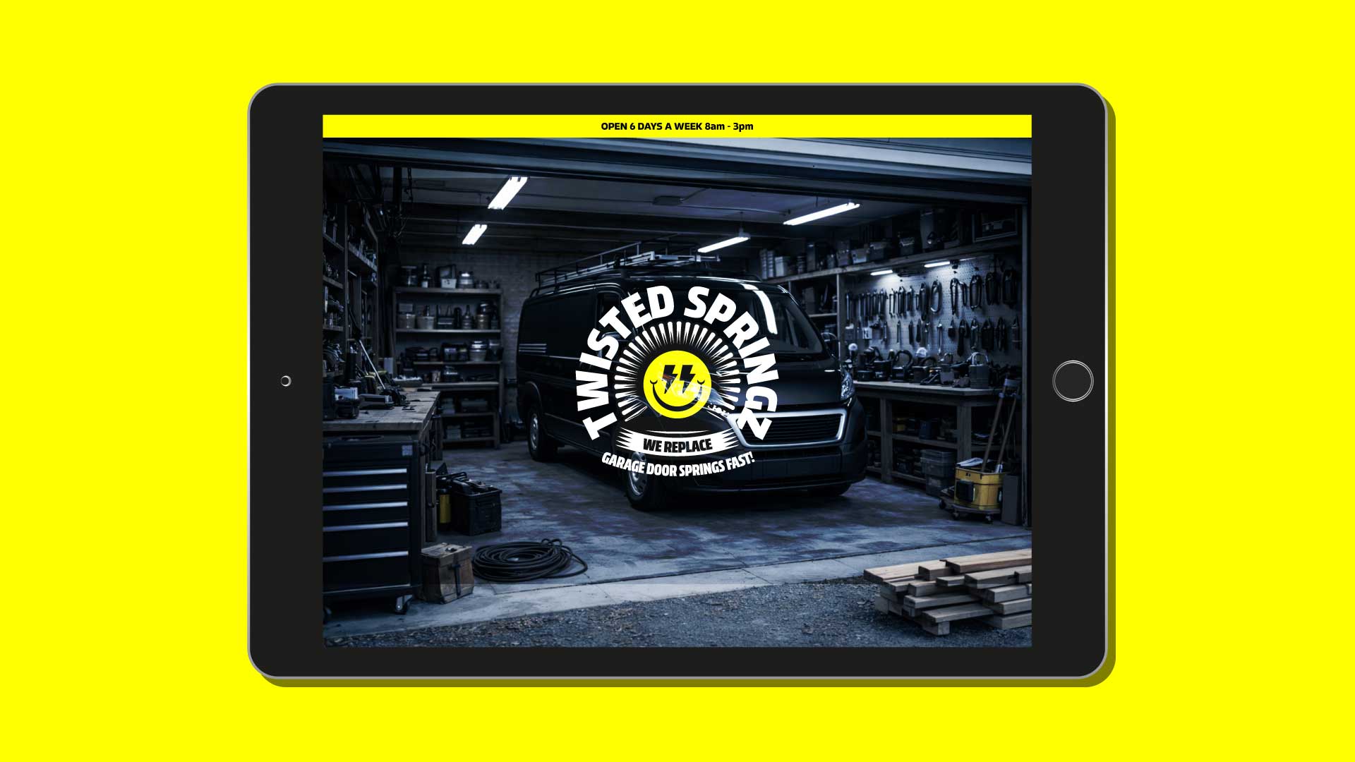
Deliverables: Logo Badge Custom Spring Pattern Brush Brand Identity Elements Door Hanger Design (Front & Back) Branded Applications (Vehicle, Apparel, Website Preview)
The Design Challenge
Two elements were mandatory in the logo:
• a garage door spring • the tagline “We replace garage door springs fast!”
Both elements needed to be integrated into the mark while keeping the logo clear, bold, and easy to recognize on vehicles and service materials. The challenge was to transform a purely mechanical object into something that feels approachable, memorable, and visually distinctive.
Logo Rationale
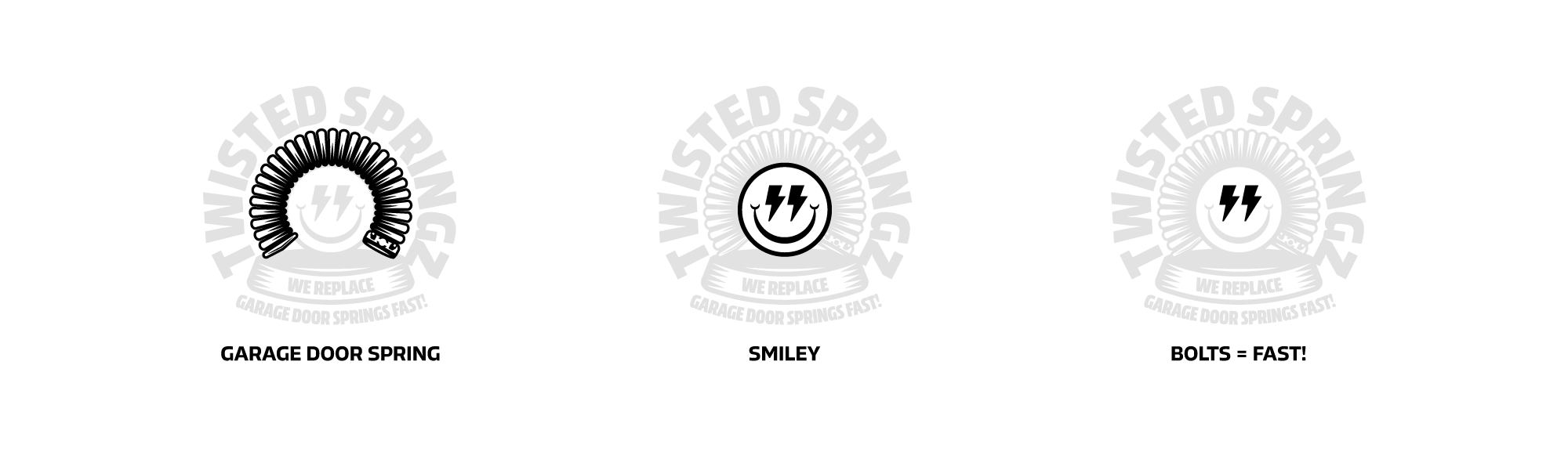
The central visual element of the identity is the garage door spring itself.
Instead of using the spring as a static illustration, it was transformed into a custom pattern brush. This allowed the spring to be drawn as a continuous circular form. When arranged in a loop, the spring naturally forms the outer shape of a badge while creating a smiling face in the center. The eyes are represented by bolts – referencing both the hardware aspect of the service and the idea of speed and efficiency.
This approach solved several challenges simultaneously:
• the spring becomes the core visual element • the circular structure creates a strong badge format • the smiling face adds personality and memorability
The result turns a mechanical component into a friendly and distinctive service mark.
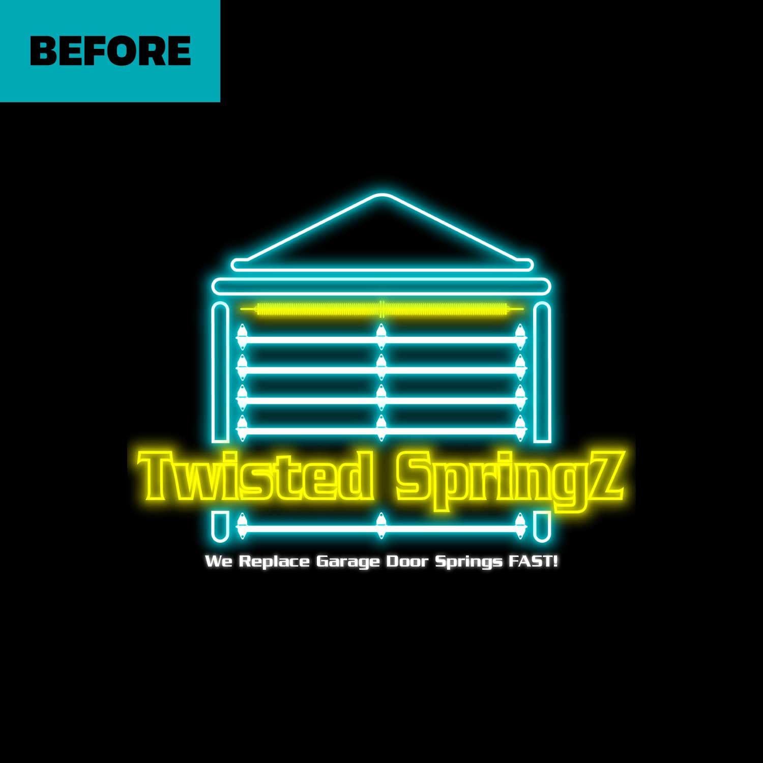
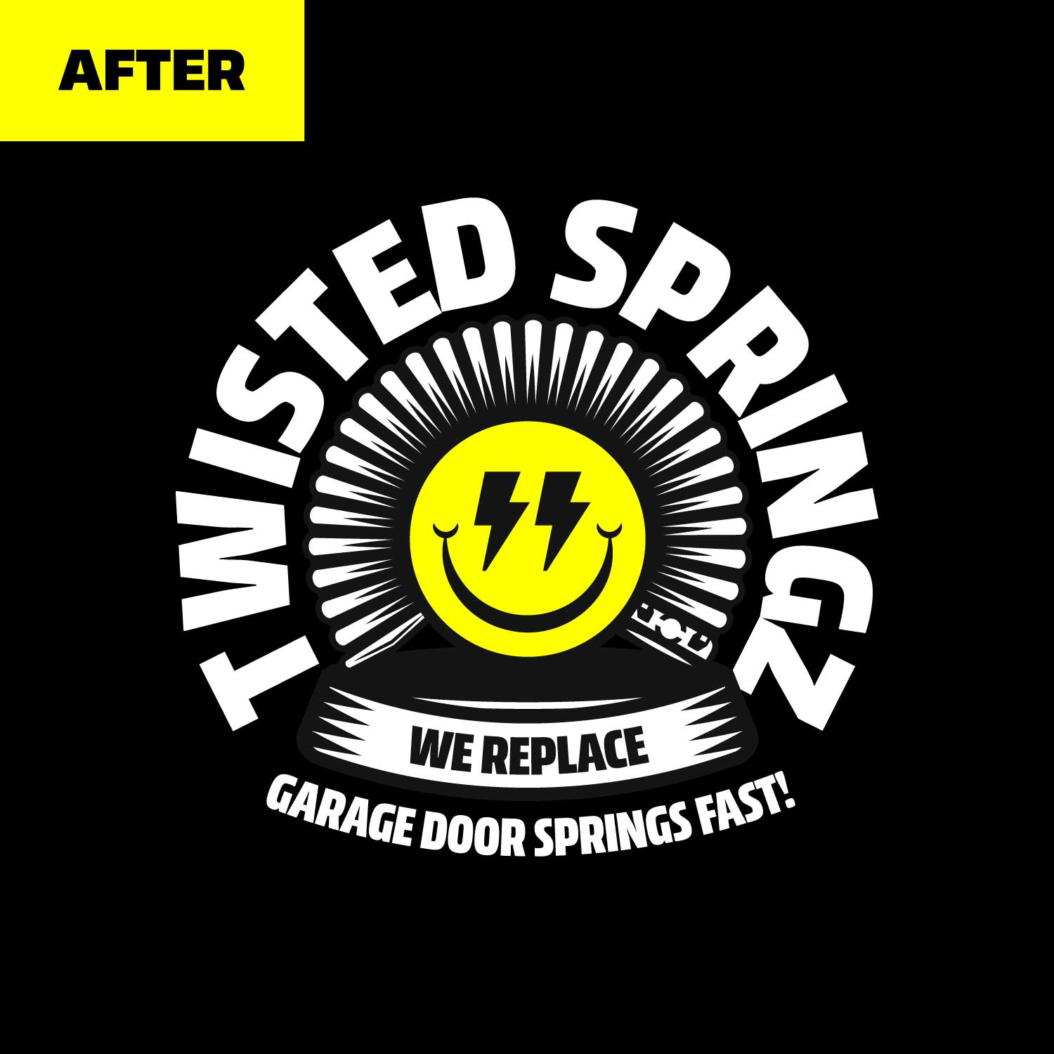
Before / After
The previous logo lacked clarity and character. The redesigned mark introduces a clear structure, stronger visual presence, and a memorable symbol built directly from the service product itself.
Badge System
The identity is built around a circular badge structure designed for high visibility in real-world applications.
Top arc: Twisted SpringZ Bottom arc: “We replace garage door springs fast!”
The circular layout keeps the mark balanced while allowing the tagline to remain fully integrated into the logo.
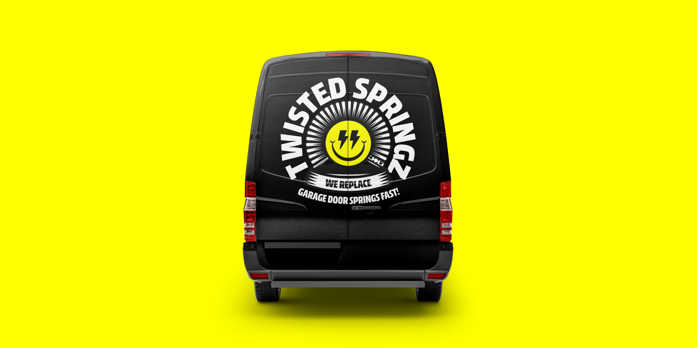
Applications
Service Visibility
Service vehicles are the primary touchpoint for the brand. The bold badge logo ensures the company is instantly recognizable when arriving on-site.
Local Marketing
Door hangers allow the brand to appear directly in residential neighborhoods where garage door spring services are needed most.
Branded Workwear
Simple branded apparel works as practical workwear while reinforcing brand recognition during service visits.
Digital Presence
The identity extends into a simple service website, maintaining visual consistency across physical and digital touchpoints.
Closing
Twisted SpringZ shows how even highly technical service businesses can benefit from strong visual identity. By turning a mechanical component into a recognizable brand symbol, the identity transforms a functional service into something memorable and approachable.
A reminder that good branding doesn’t depend on the industry – only on the idea behind it.
“Manuel nailed our logo and branding exactly how we imagined it. A true 5-star experience working with him.”