A quick note before diving in: This case study lives here on the blog - not in my client portfolio. The portfolio is reserved for client work. The blog is where I document personal projects, experiments, and the evolution of my own brand. Some things don’t fit neatly into a “client project” box - but are still an important part of the journey. This identity is one of them. This identity marks a shift toward a clearer, more intentional system - while staying rooted in bold, character-driven design.
Background
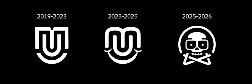
Before this mark, my branding went through a few phases. The first version was a monogram built from the letters M and U, drawn with parallel strokes and equal line weight, combined with a small smile underneath. It was clean, ownable, and worked well – but over time it started to feel slightly generic. The rounded forms often drifted into a softer, almost playful territory that didn’t fully reflect the strength of my work.
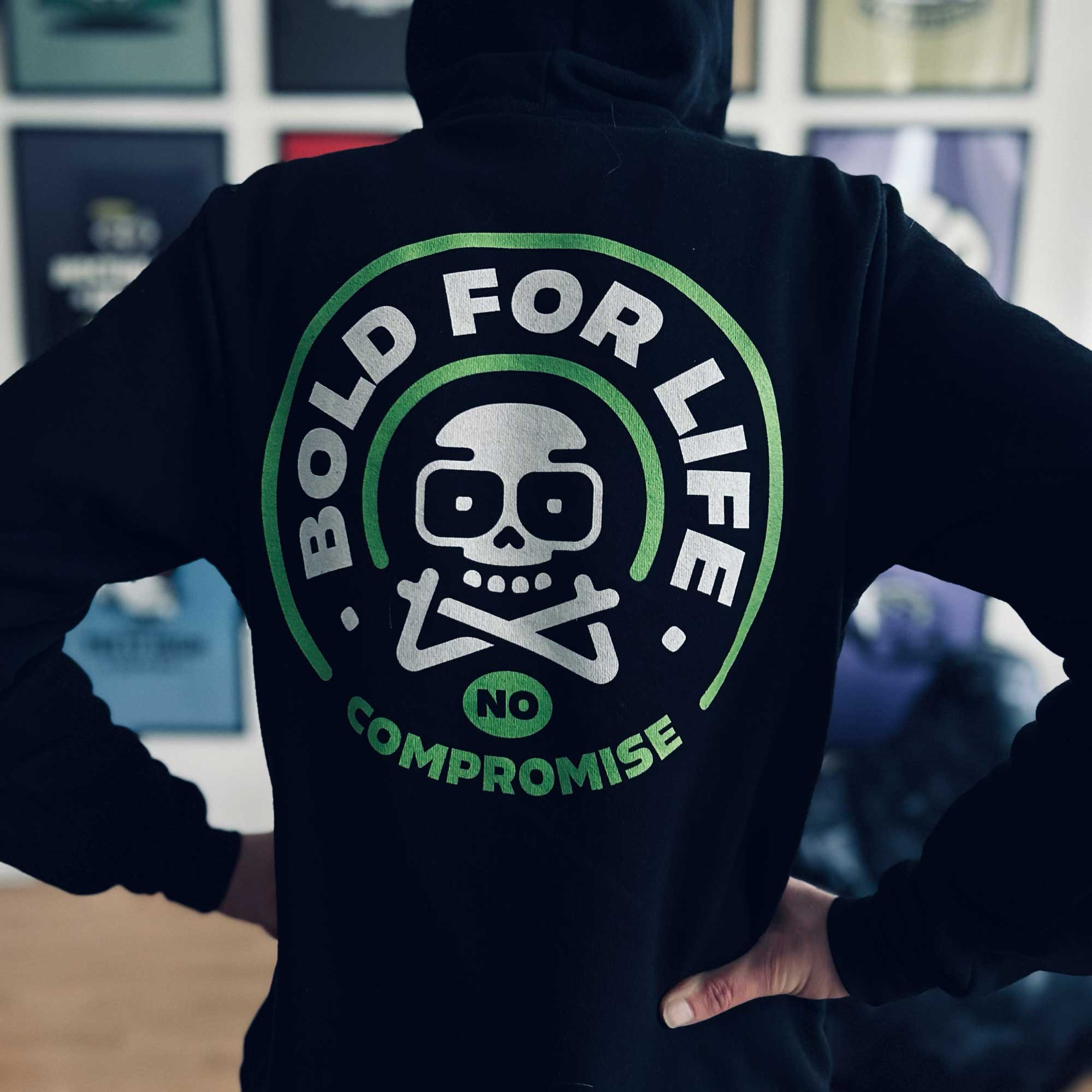
Later, I moved into a much bolder direction: a skull mark with crossed arms as crossbones. This symbol became the foundation for the Bold for Life concept, which still lives on in my apparel work and as a trust-style badge across my brand.
While the skull carried strong attitude, it also came with a certain heaviness and aggressiveness – something that no longer fully represented how I work today.
The Goal
The new identity needed to:
• feel more personal
• reference my name (MU) directly
• introduce character in a friendlier, more minimal way
• function as a flexible system across branding, content, and apparel
• stay bold without becoming harsh
In short: less brutality, more clarity – without losing backbone.
The Concept – A Moving Monogram Character
The new mark is built around a stylized MU monogram, where the center shape rounds into a subtle U, forming a smiling expression in negative space. The lower portion turns into walking legs – transforming the logo into a moving character rather than a static symbol.
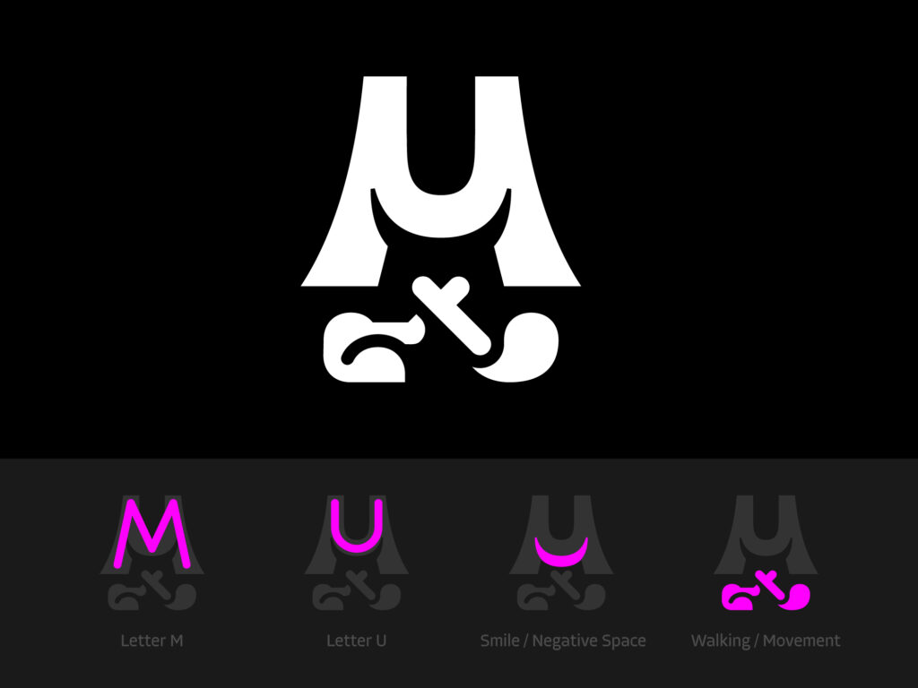
This brings together:
• personal reference (MU)
• mascot-like approachability
• movement as a metaphor for progress
• minimal form with strong presence
The result is a mark that feels alive, intentional, and unmistakably mine.
The Logo System
To ensure consistency across different contexts, the identity was designed as a flexible system:
Primary Mark

The standalone MU character for strong, bold presence.
Horizontal Lockup
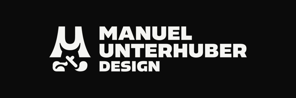
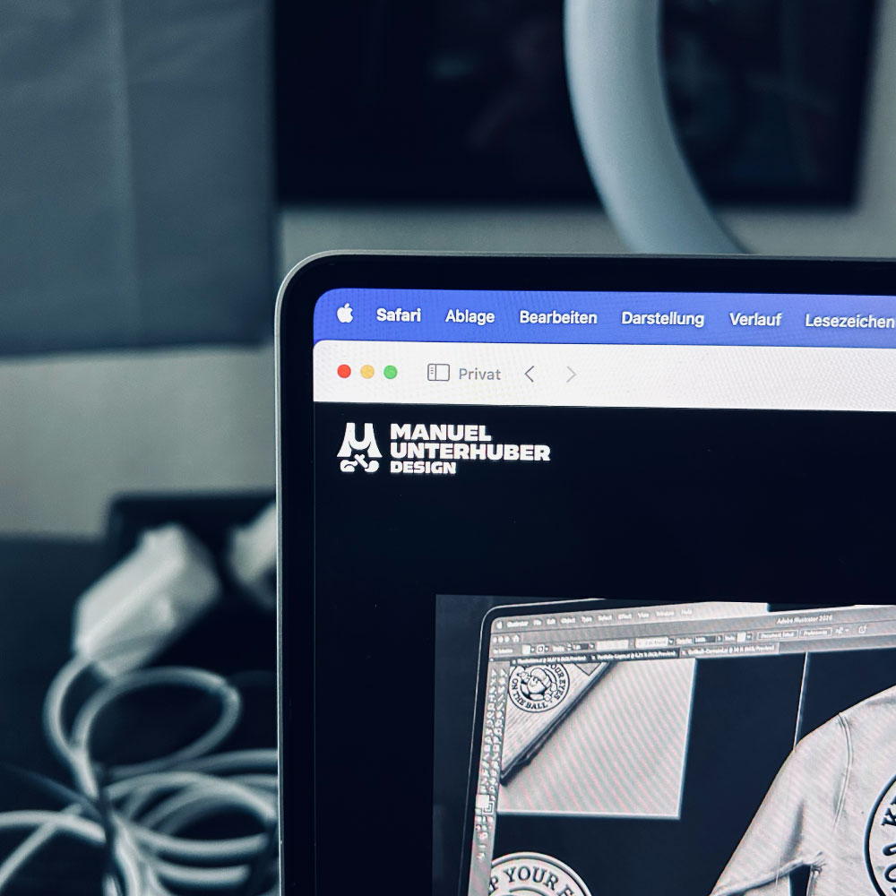
The character paired with the stacked wordmark Manuel Unterhuber Design for structured layouts and headers.
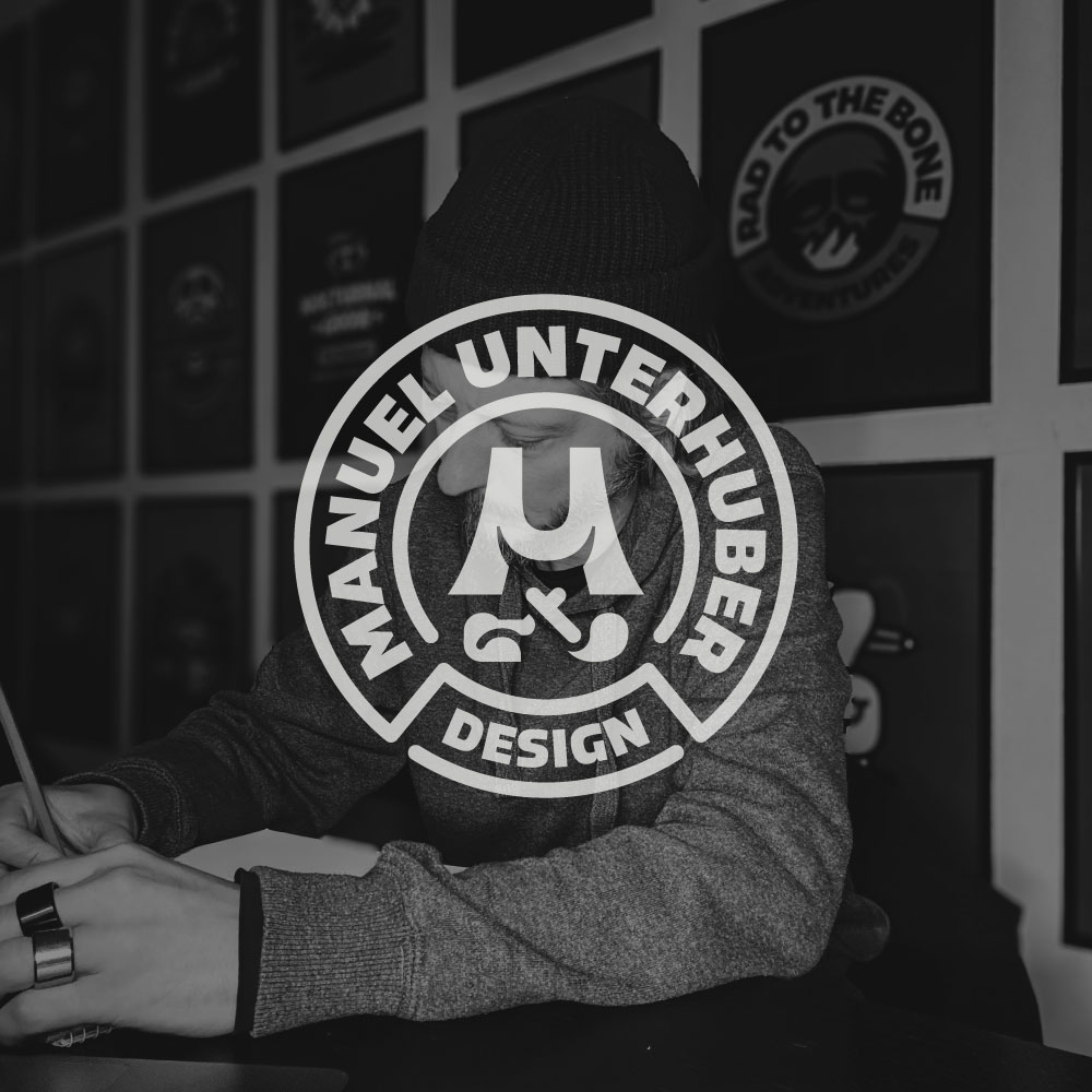
Circle Badge
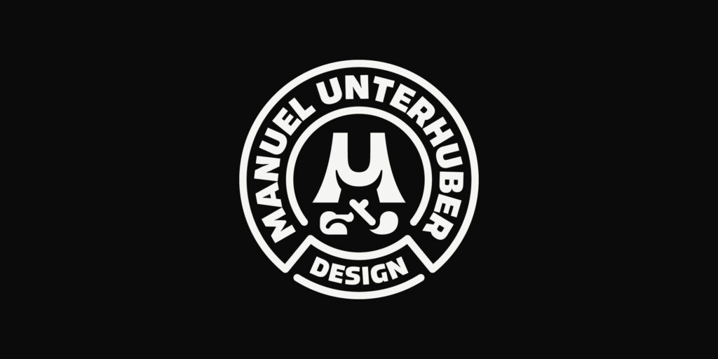
A compact version for squares and spaces where a wider logo wouldn’t fit naturally. Each format works independently – while always feeling part of the same visual language.
Color & Typography
The color palette is intentionally reduced – keeping the identity neutral and flexible, so it never competes with client work or overwhelms the surrounding visuals.
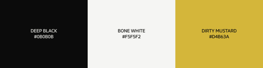
• Bone White on deep Black as the core contrast
• Dirty Mustard as a bold accent for emphasis and energy
This keeps the identity timeless, highly legible, and adaptable.
Typography is built around the Allotrope Variable family – allowing flexibility in hierarchy, rhythm, and expression while staying within one coherent system.
Iconography – A More Expressive Layer of the System
Alongside the logo, a custom icon set was created to extend the identity into everyday brand touchpoints. While the core mark stays minimal and highly reduced, the icons introduce a slightly more illustrative, expressive layer – adding personality without losing clarity. They are primarily designed for light backgrounds, where the line work and details can breathe, while still scaling down well for UI use.
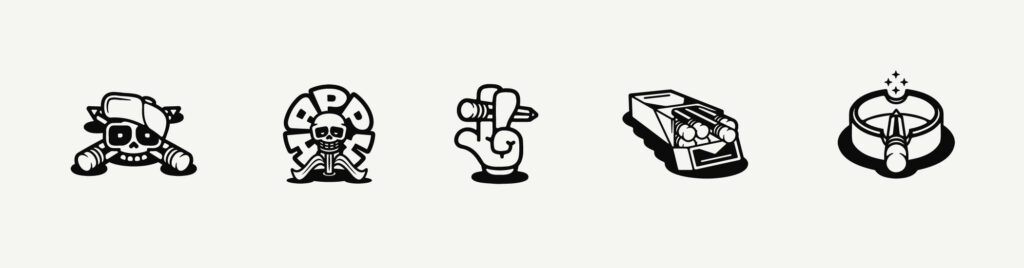
The iconography supports:
• service overviews
• inquiry flows
• confirmation and thank-you pages
Turning functional UI moments into branded experiences.
The Bold for Life Badge – A Trust Element
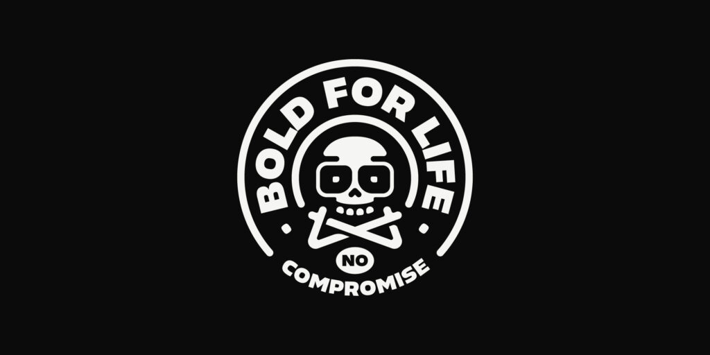
The Bold for Life – No Compromise badge acts as a secondary brand layer. Rather than replacing the main logo, it functions as a trust-style mark – a visual promise of strong decisions, craft, and consistency. Used selectively across the website, content, and apparel, it reinforces values rather than hierarchy, adding emotional depth to the system.
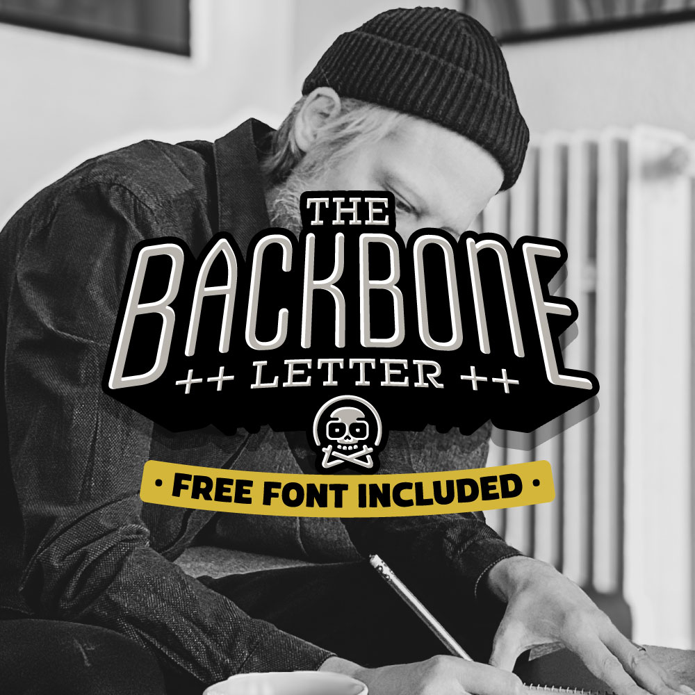
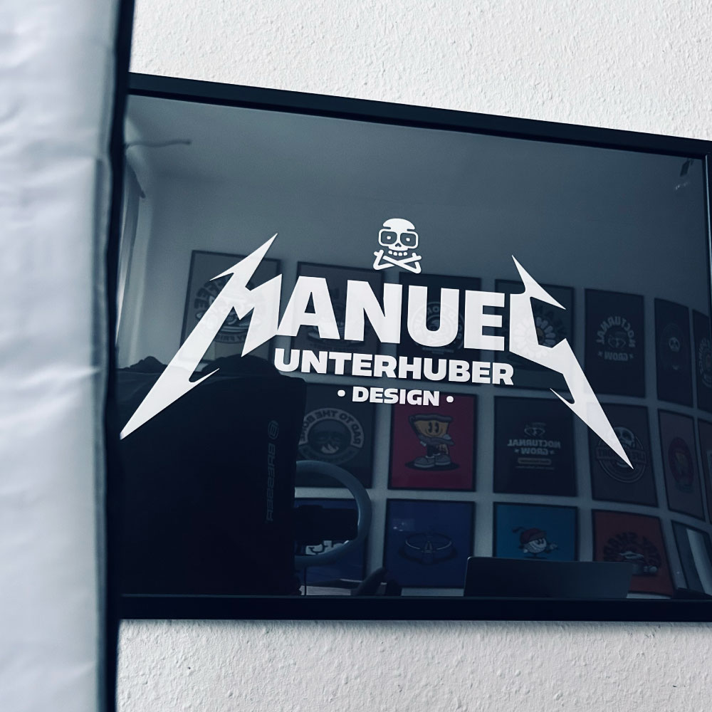
The Wordmark – Injecting Attitude
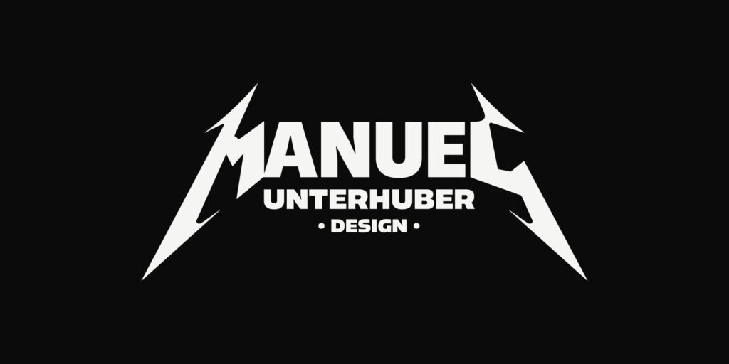
To balance the minimal system with edge and personality, a bold wordmark inspired by classic metal lettering was introduced.
This layer brings:
• rebellion
• confidence
• energy
• a no-compromise feel
Used sparingly, it adds emotional punch without breaking the clean structure of the core identity.
Applications
The identity was designed as a flexible system – working across digital, content, and physical touchpoints.

A Layered Brand System
The identity works through clearly defined layers:
• Core logo system – minimal and flexible
• Iconography – expressive and functional
• Badge elements – trust and values
• Attitude wordmark – emotional impact
Each layer serves a distinct purpose while speaking the same visual language. This keeps the brand bold without becoming noisy – and expressive without losing clarity.
Why This Identity Works
Compared to previous iterations, this system:
• feels more personal and ownable
• introduces character without aggression
• scales effortlessly across formats
• supports branding, content, and apparel equally
• communicates momentum and clarity
It’s not louder. Just clearer.
Closing Thought
This identity wasn’t about reinvention.
It was about alignment – bringing how I present myself in line with how I actually work today:
structured, intentional, bold, and built to move.