This section highlights apparel-focused projects developed as standalone systems — built to live on fabric first.
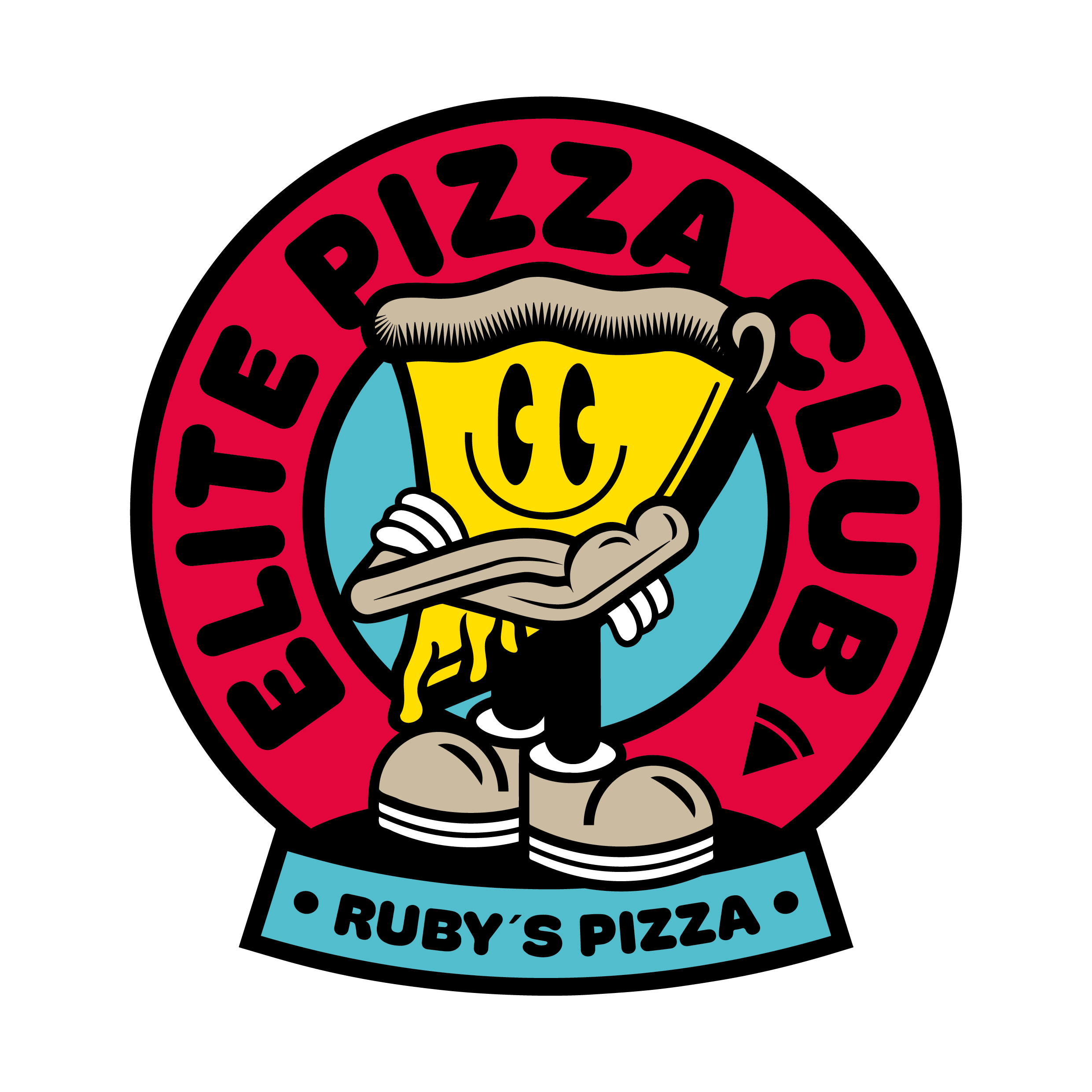
Ruby´s Pizza
Ruby’s Pizza wanted a bold graphic element designed specifically for apparel. The result is a confident pizza character badge built to function as a wearable statement.
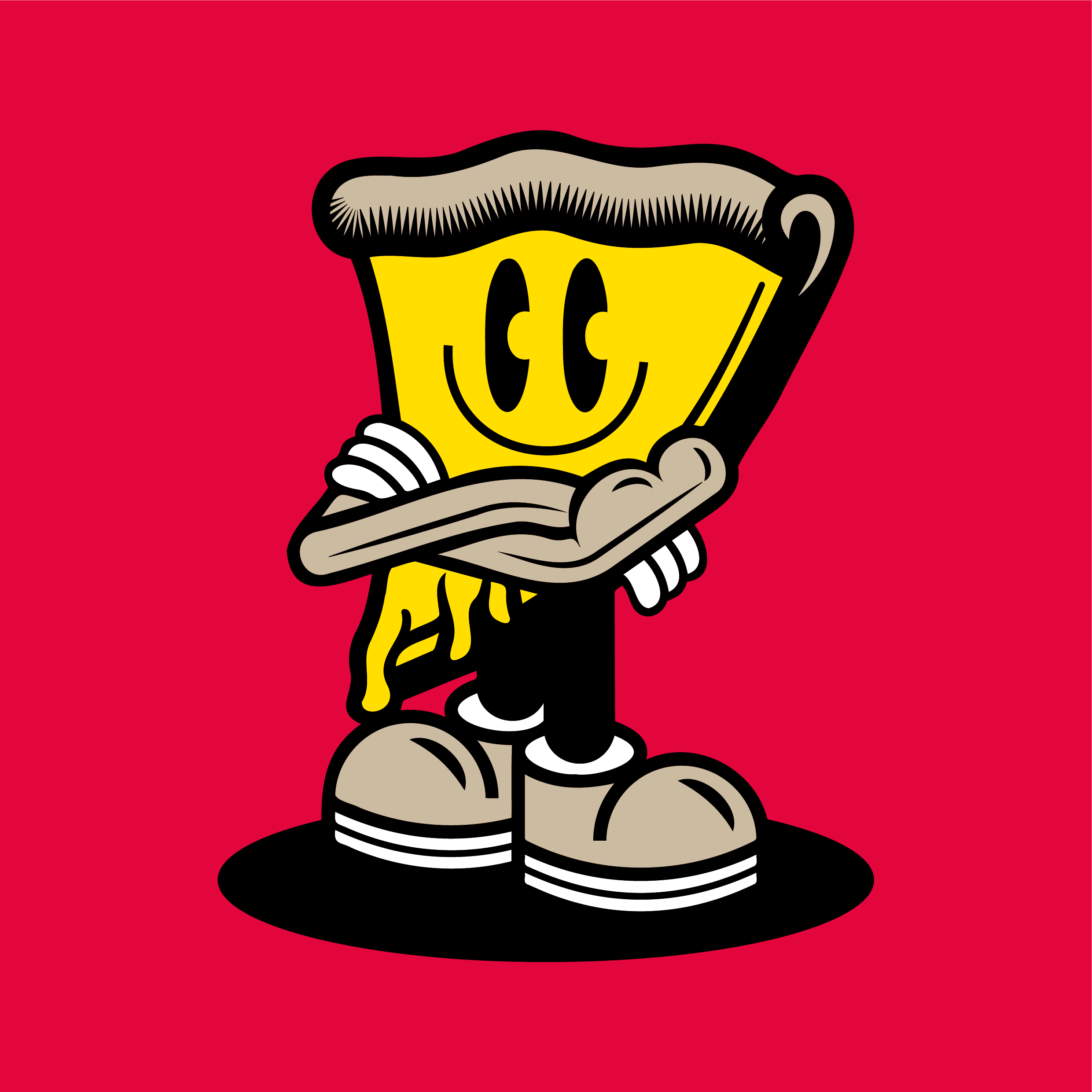
The character stands like a bouncer — arms crossed, muscular, unapologetic. The primary badge reads “Elite Pizza Club”, with “Ruby’s Pizza” positioned subtly beneath. A standalone character version allows flexible use across different garment formats.
Deliverables: Pizza Character Badge Character Illustration (Standalone)
“Manuel did an awesome job on our character design. He created multiple variations until everything matched our expectations. It was a real pleasure working with him. Our next design will definitely be an Unterhuber.”
Rouven / Ruby´s Pizza
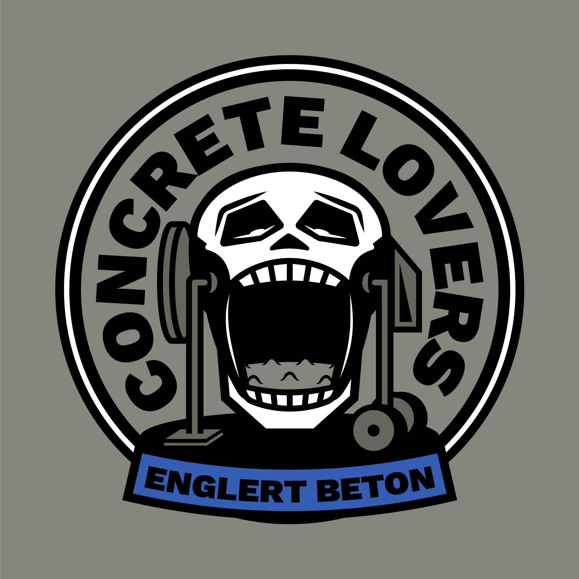
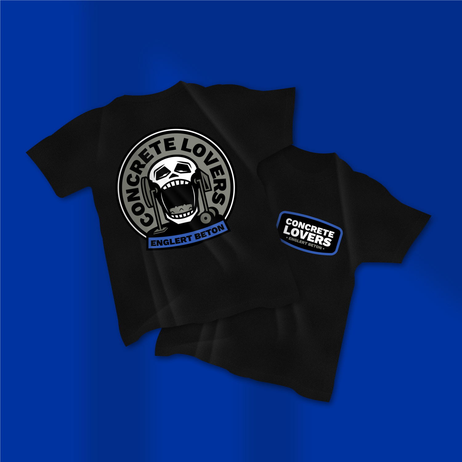
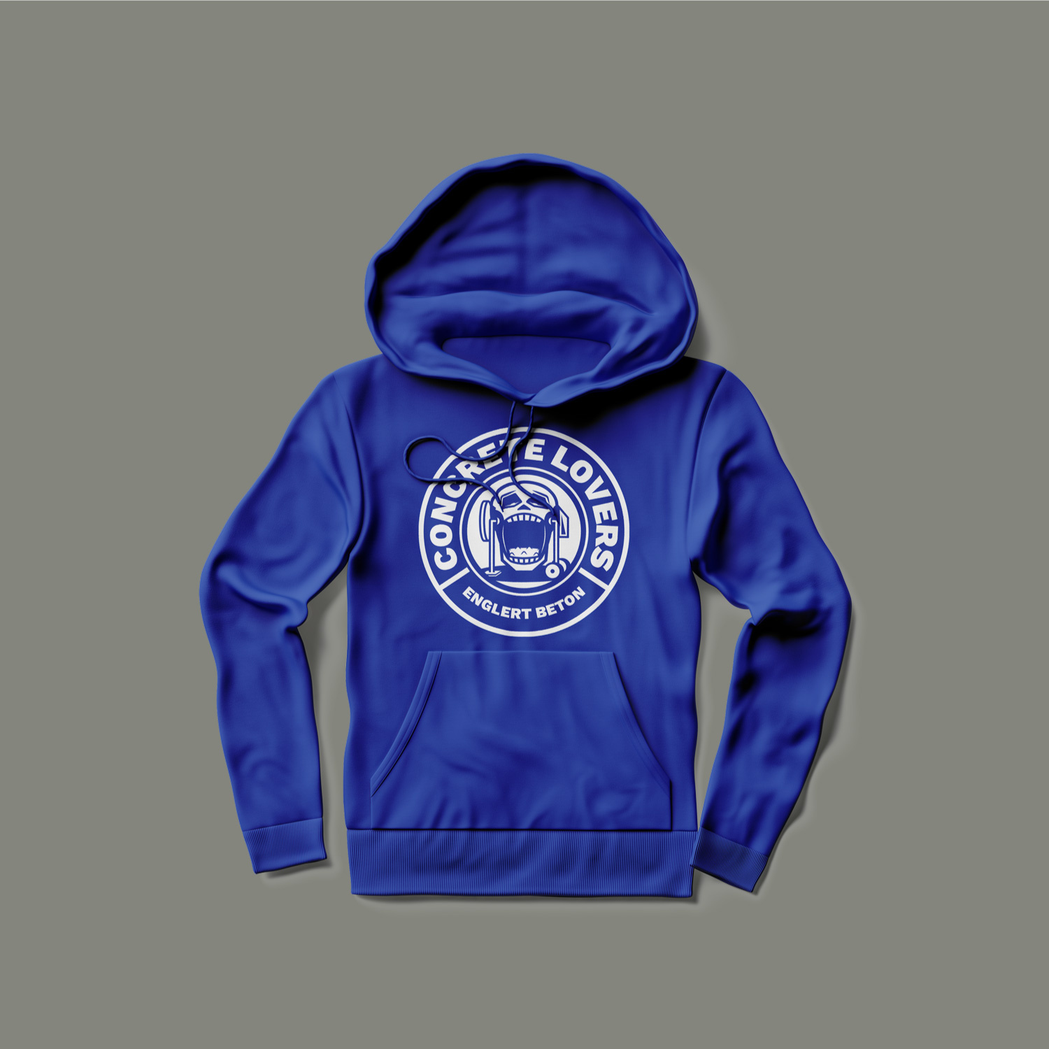
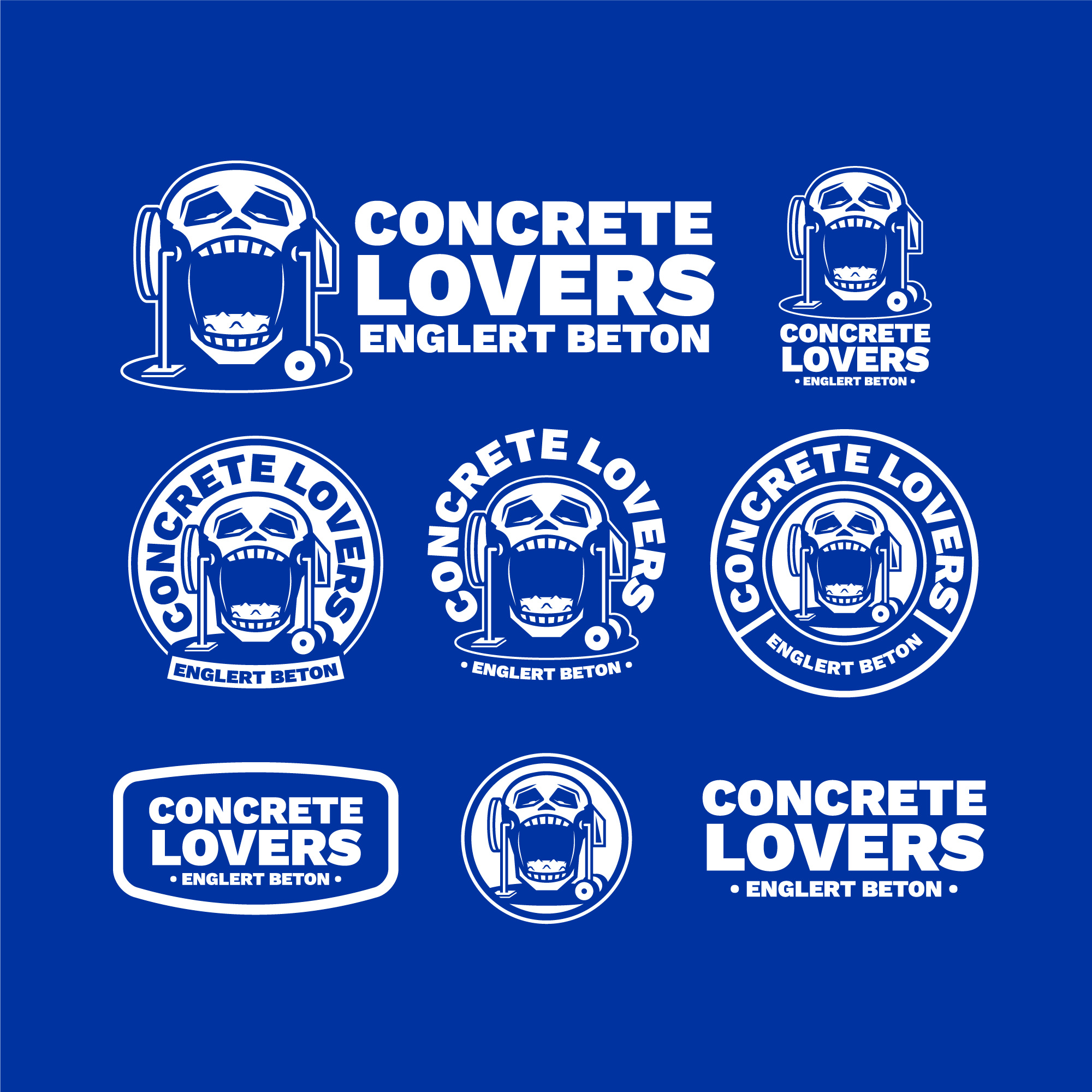
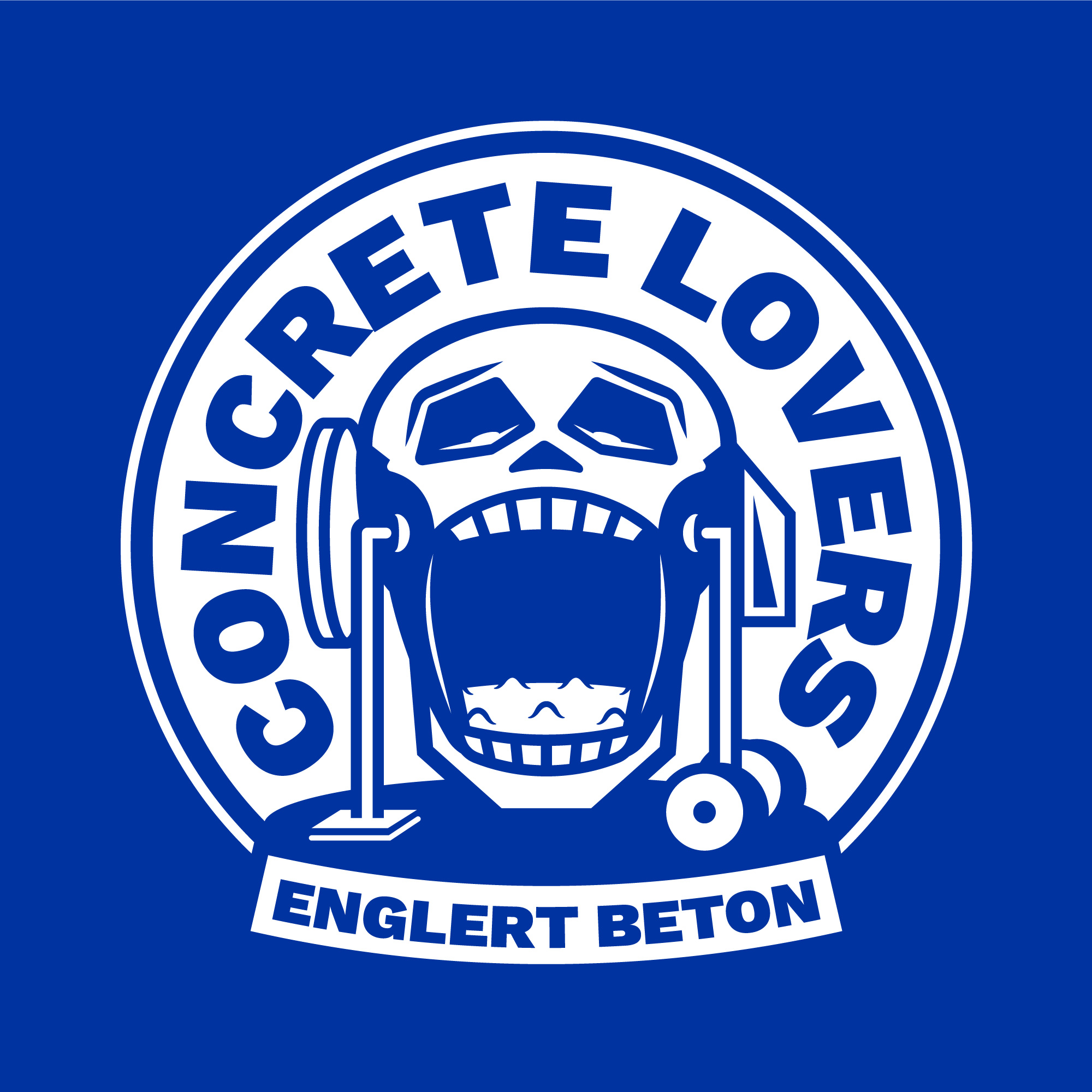
Englert Beton
Englert Beton requested a skull-based design connected to the construction industry. The concept transforms a concrete mixer into a skull – the open mouth filled with concrete.
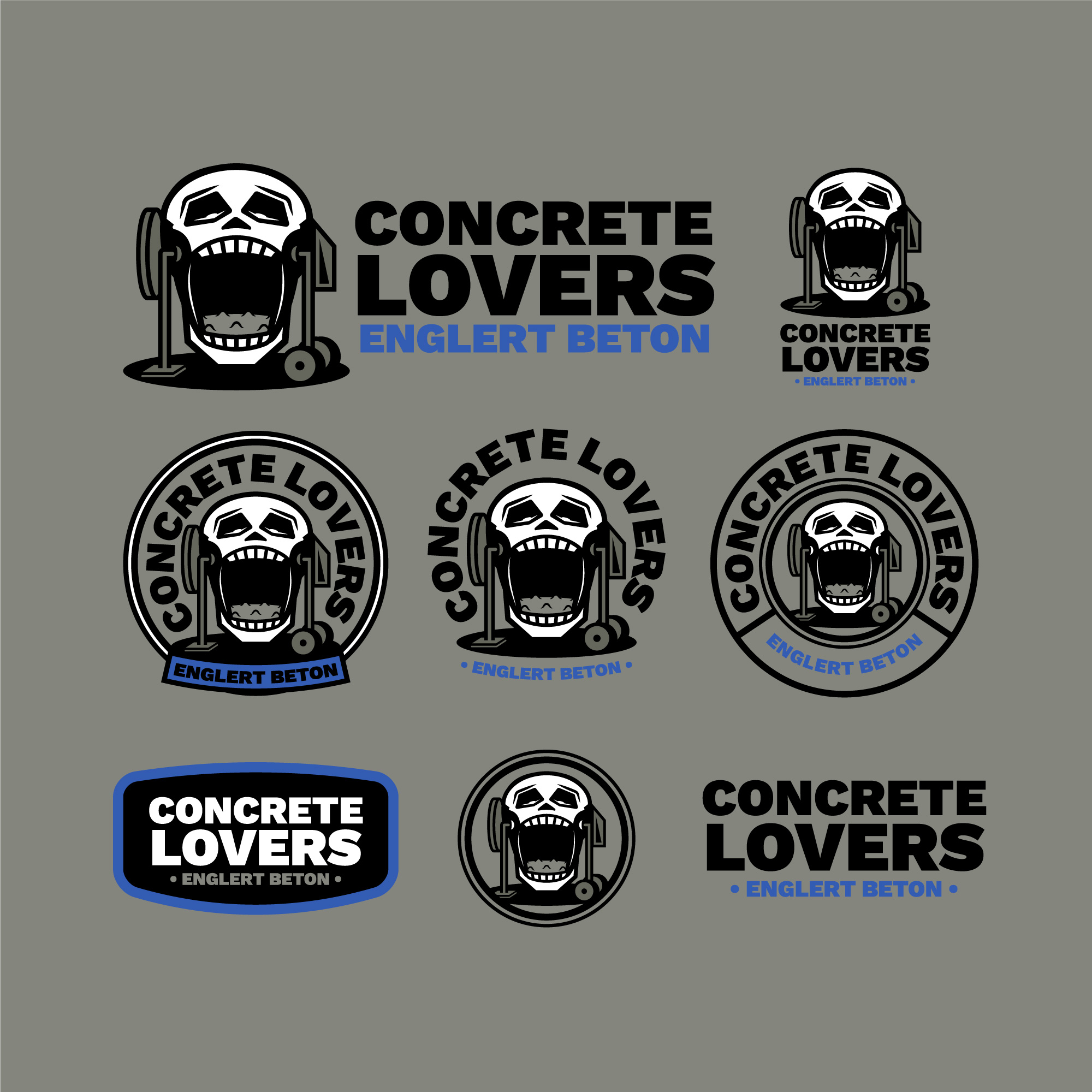
The primary badge features “Concrete Lovers” prominently, with “Englert Beton” positioned below. Additional lockups and badge variations allow flexible use across workwear and merchandise formats.
Client: Englert Beton Location: Germany Industry: Construction Service: Apparel Graphics
Deliverables: Typographic Triangle Mark Apparel-Ready Graphic Lockup
Ripped & Roasted Coffee Co.
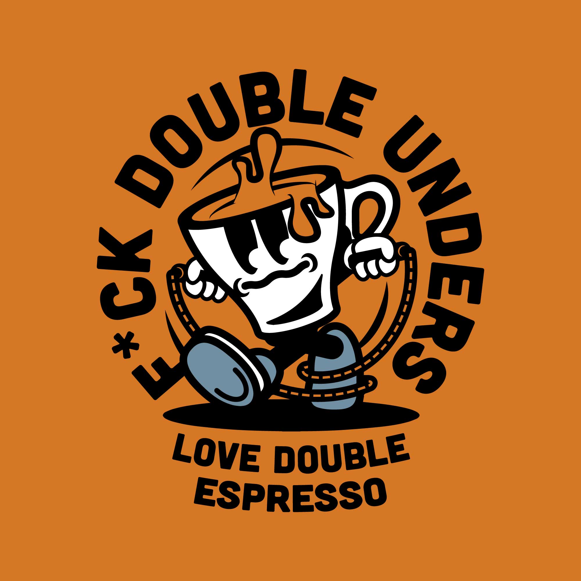
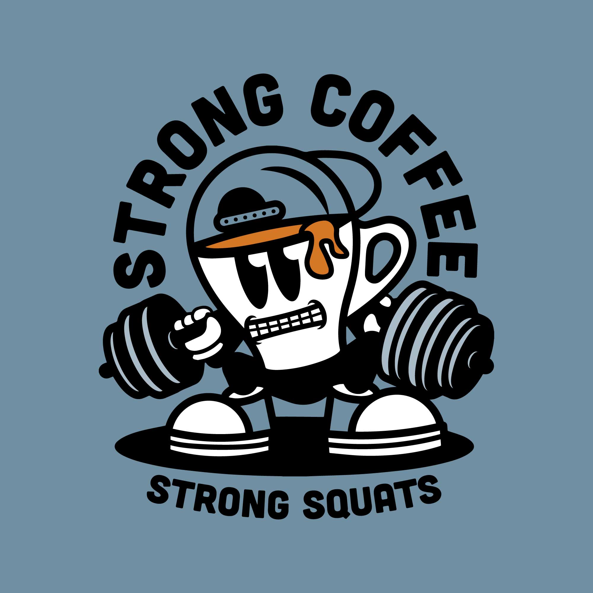
Ripped & Roasted blends fitness culture with coffee obsession. Two apparel graphics were developed around an espresso cup character – expressive, slightly exaggerated, and built for wearable humor.
One design shows the cup attempting double unders, tangled in the rope as espresso spills out. Headline: “F*ck double unders” Subline: “Love double espresso”
The second design features the same character lifting a bending barbell – strained expression, coffee dripping like sweat. Headline: “Strong coffee” Subline: “Strong squats”
Both graphics are built as bold, apparel-first statements – playful, relatable, and instantly readable from a distance.
Deliverables: Character-Based Graphic Series Two Badge-Style Apparel Designs
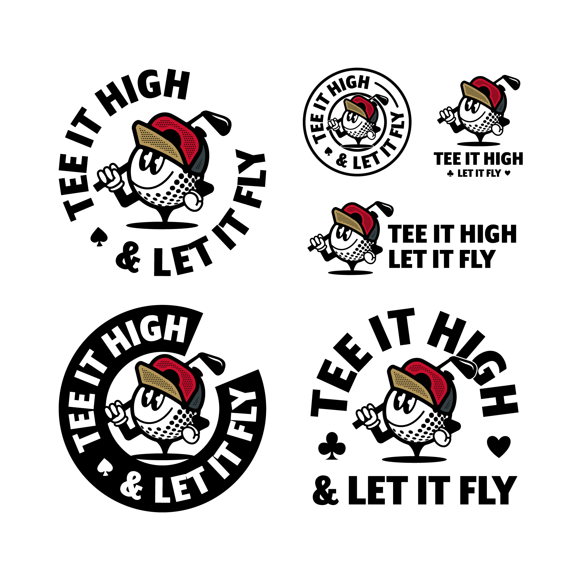
Blackjack Sports Co.
Blackjack Sports Co. required a bold, character-driven graphic for their golf apparel line. The concept centers around a confident golf ball character — cap on, one hand on the hip, the other resting a club over the shoulder.
The primary badge reads: “Tee It High” (top) “Let It Fly” (bottom)
The system includes horizontal, stacked, and badge variations – built for flexible use across garments and formats. The result is playful but controlled — a graphic identity element designed to feel confident on and off the course.