A character-driven streetwear identity built around humor, irony, and the reality of having less – but making it look good anyway.
Concept
BROKE A$$ GOODS embraces the contradiction. Empty pockets. Full attitude.
The brand plays with the universal feeling of being broke – not as defeat, but as shared experience. The tone is self-aware, playful, and slightly rebellious. The goal wasn’t to glamorize struggle. It was to turn it into character.
Challenge
Translate the brand’s “Strugglin’ but still hustlin’” mindset into a fun, character-driven visual identity built for streetwear – humorous, bold, and instantly recognizable.
Client: Broke A$$ Goods Industry: Streetwear / Apparel Location: USA
Scope: Visual Identity System Character Illustration Badge Logo System
Deliverables: Primary badge logo BAG lettermark Character illustration Color system
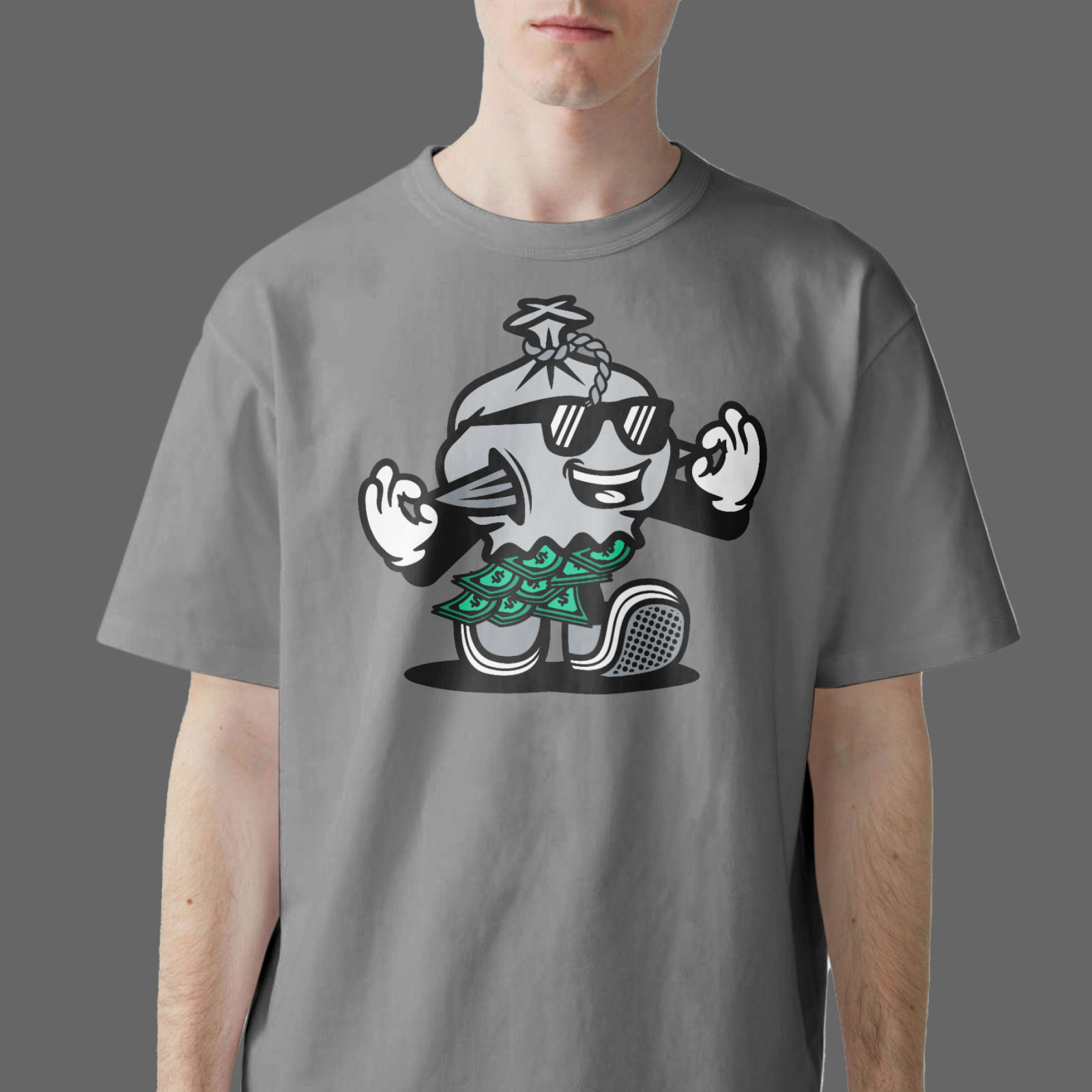
The Character
At the center of the identity is a walking money bag character. Clean vector. Bold black outlines. Minimal color. Neutral grey sack. Two-tone green bills. Subtle dollar marks.
His pockets are turned inside out – completely empty. Dollar bills fall from the bottom. He’s wearing sunglasses. And he’s laughing. Not desperate. Not defeated. Laughing.
The character captures the brand’s core idea: We might be broke – but we’re not done. It’s playful without being childish. Graphic without being noisy. And simple enough to live comfortably on apparel.
The money bag character started as a client concept – the empty pockets and falling bills evolved it into a stronger visual metaphor.
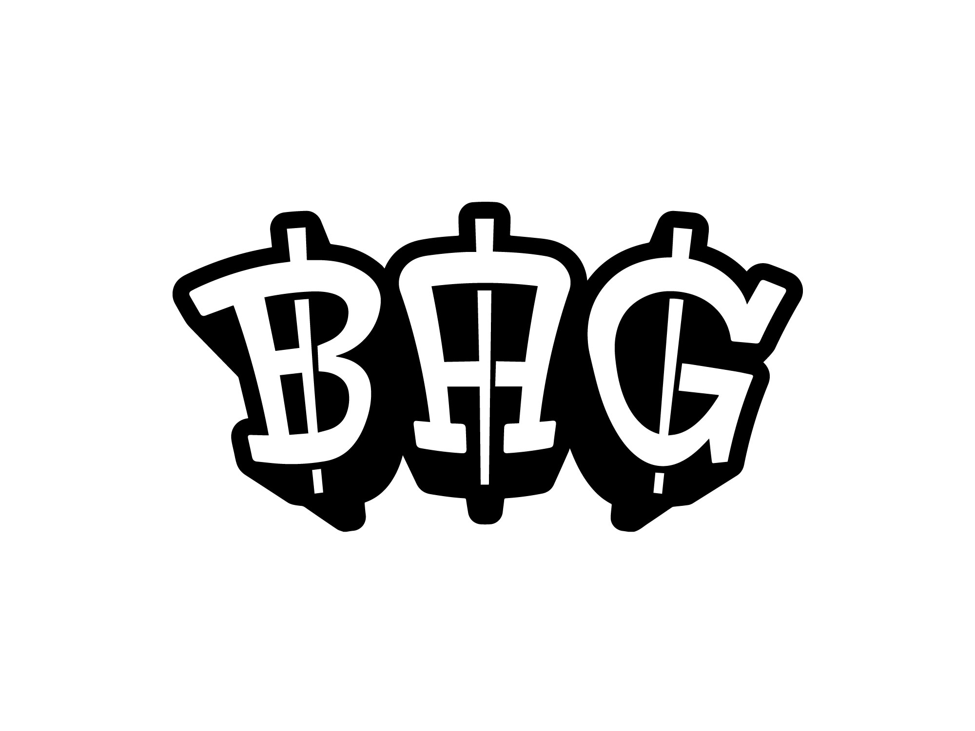
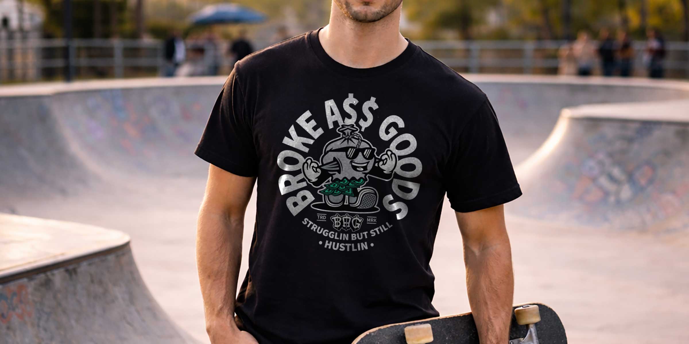
The Badge System
The logo was designed as a bold, self-contained badge – built for streetwear first. A circular layout frames the identity: The brand name across the top. The slogan across the bottom.
At the center sits the character – supported by the BAG lettermark, each letter pierced with vertical strokes referencing the dollar sign. Small TRD and MRK details complete the mark, adding a subtle manufactured, street-inspired feel.
The result feels bold, playful, and instantly recognizable. And most importantly – made to live comfortably on apparel.
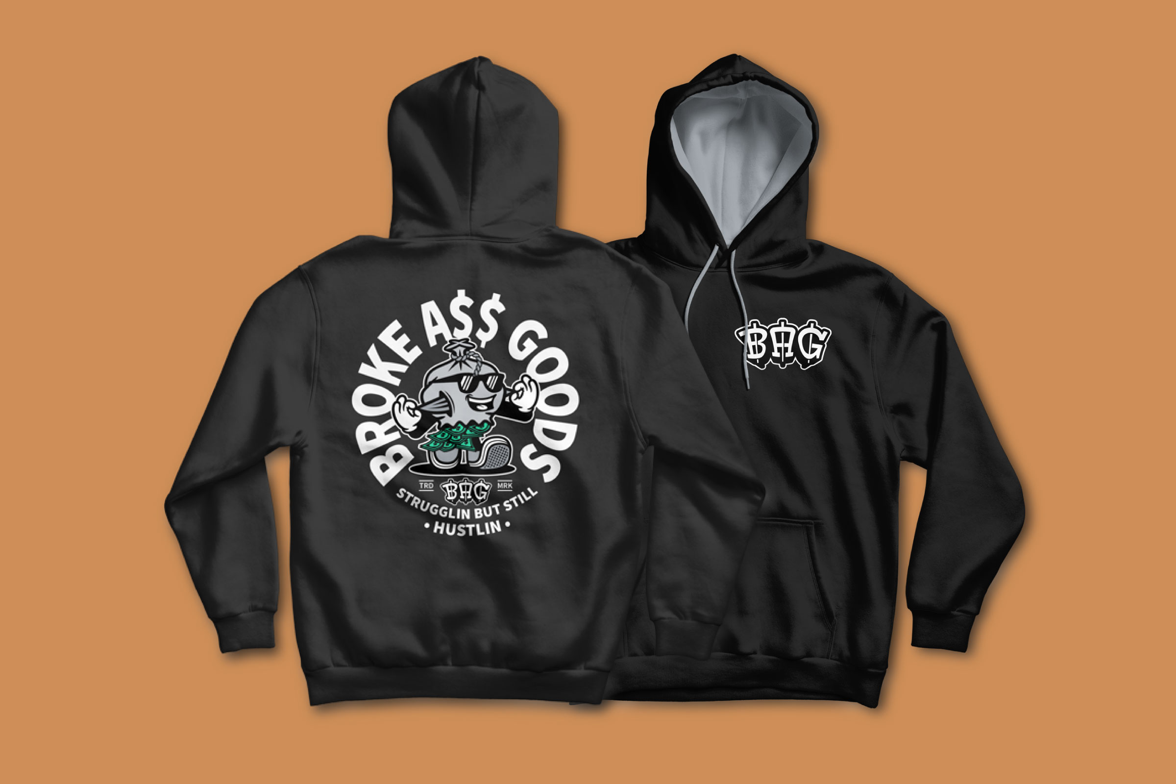
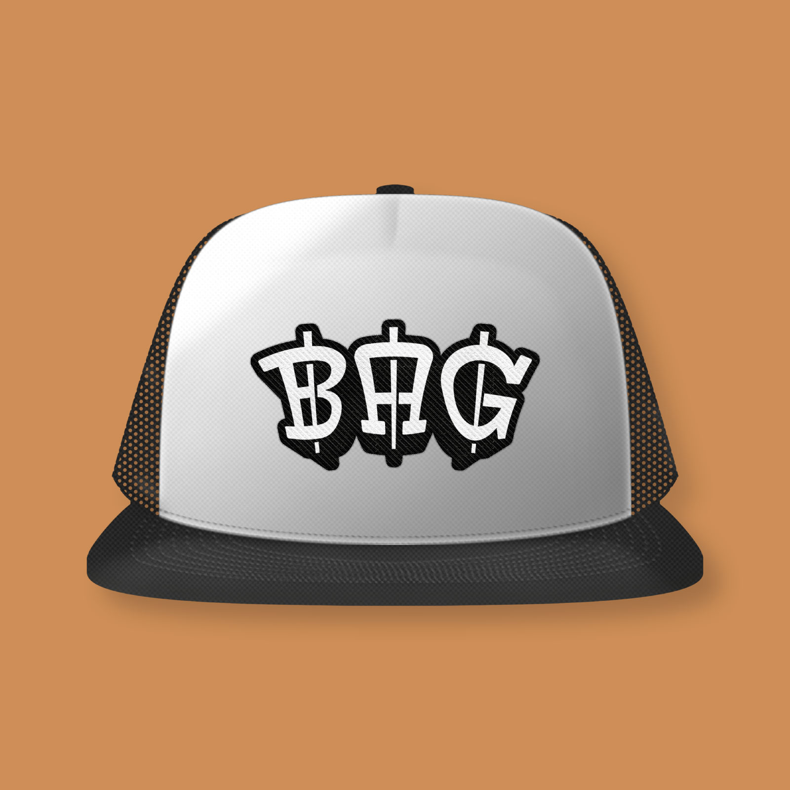
Flexible Identity Elements
To keep the system adaptable, the identity was broken into key components:
The full badge logo
The BAG lettermark
The character on its own
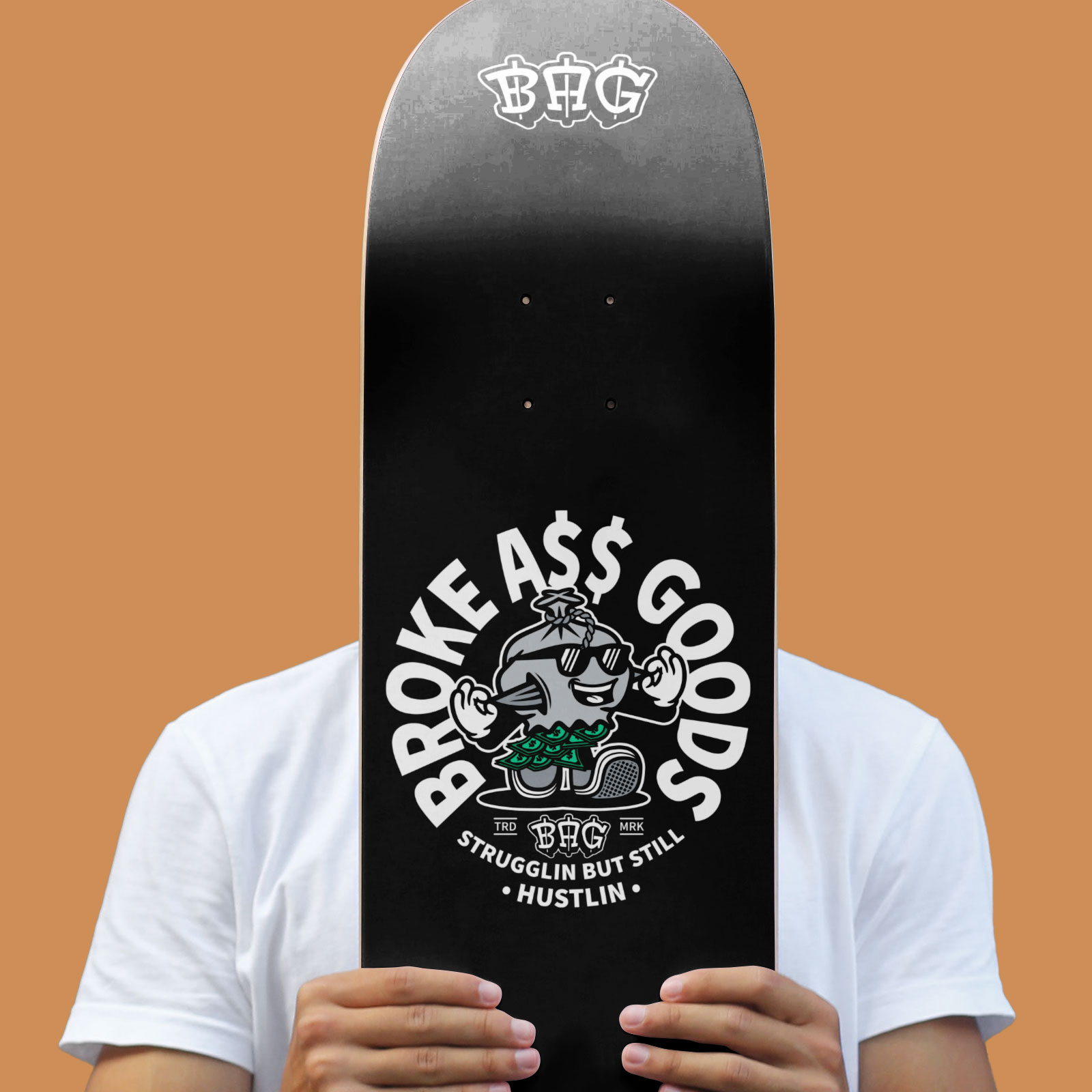
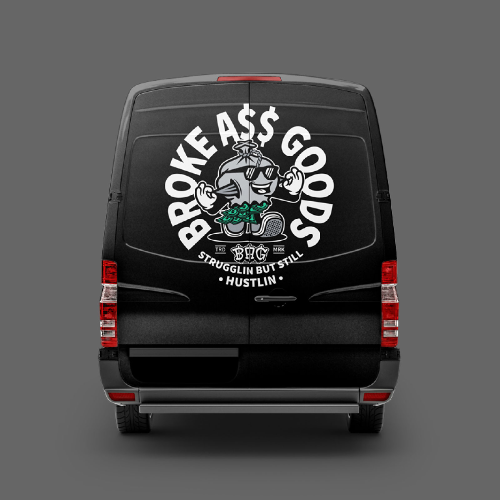
Each element works independently while still feeling part of the same world. Used together or on their own, the brand stays recognizable – whether on a hoodie, skateboard, sticker, or vehicle.
Color & Tone
The color palette was intentionally kept minimal. Neutral greys for the character. Two shades of green for the falling bills. Strong black and white for maximum contrast. Nothing decorative. Nothing trendy.
The reduced palette keeps the focus on form, character, and message – while ensuring the identity stays bold and legible across apparel and physical products.
Attitude & Voice
The brand tone lives in contrast.
Struggle – but with humor. Reality – but with confidence. Irony – without bitterness.
BROKE A$$ GOODS doesn’t complain about having less. It owns it. The laughing character, the playful typography, and the raw graphic style work together to turn everyday financial reality into something relatable, wearable, and fun.
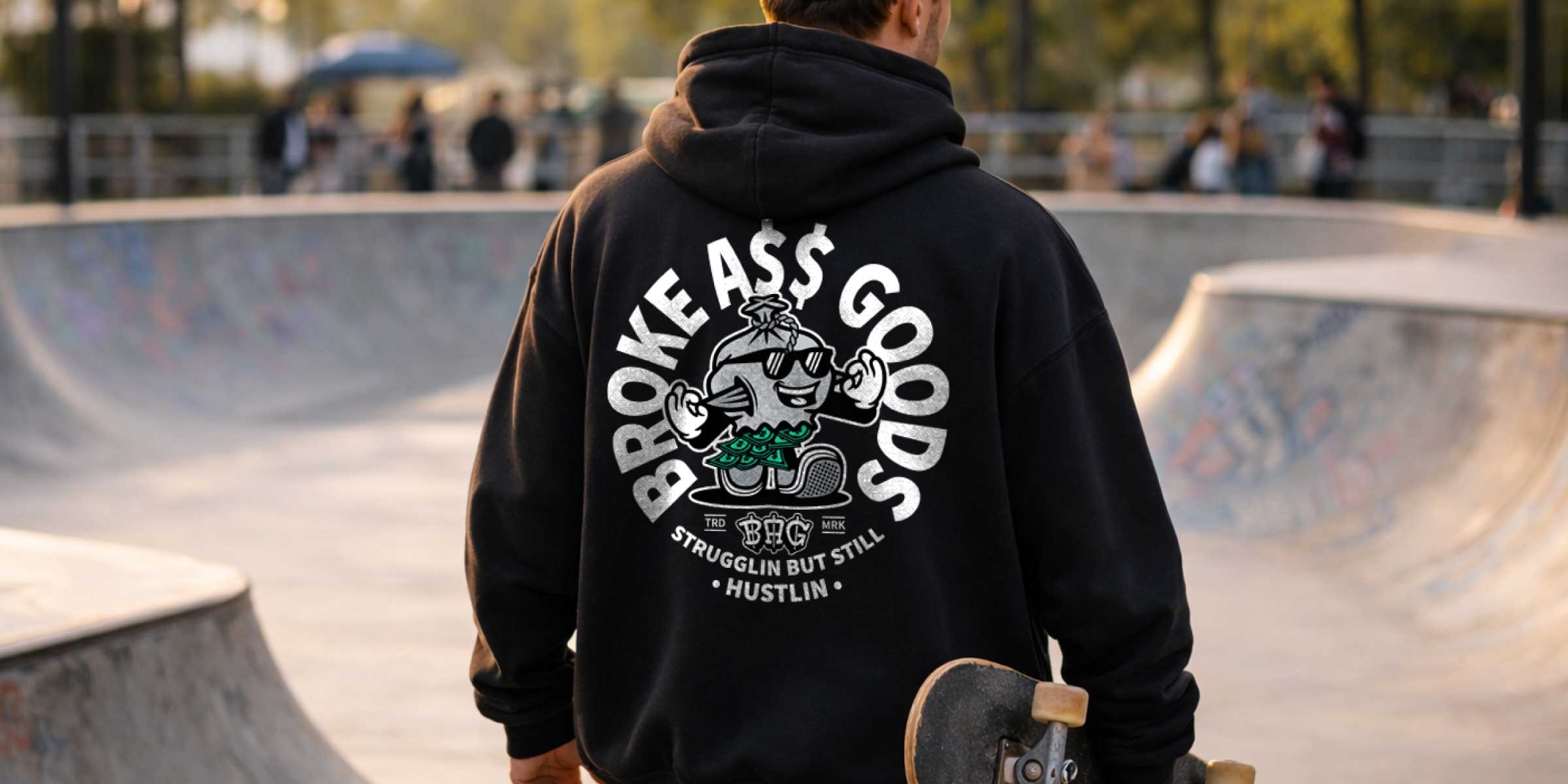
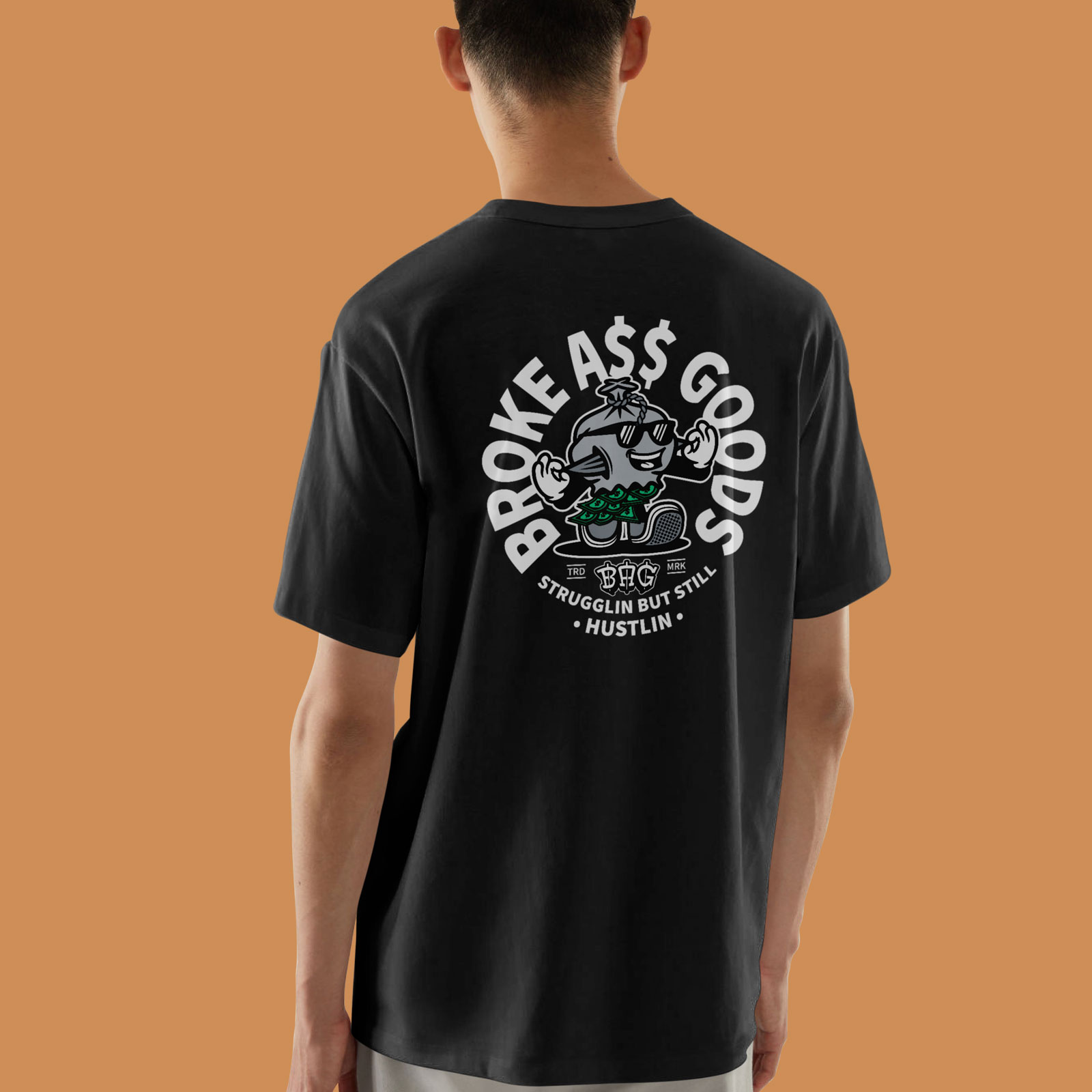
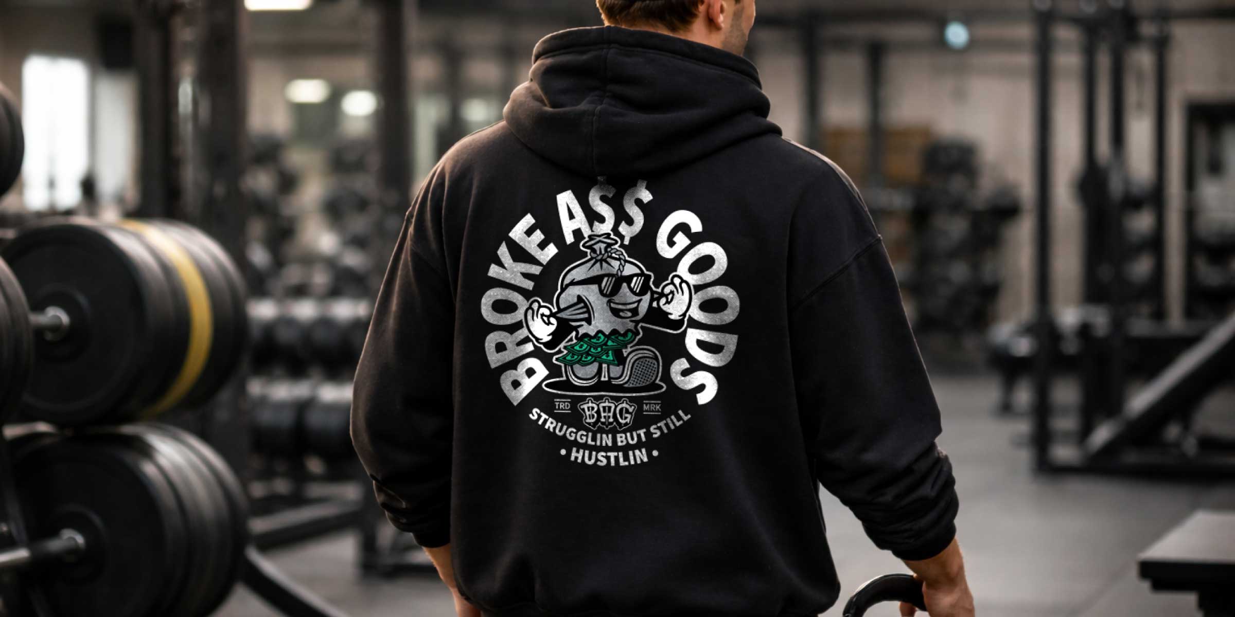
Applications
Designed to live on fabric first. The identity was built with apparel in mind – bold, scalable, and instantly recognizable from a distance. On hoodies and T-shirts, the badge becomes a statement piece. The character works oversized on the back or minimal on the chest. The BAG lettermark functions as a subtle branding element on sleeves, hems, or tags.
The system adapts easily across formats:
Screen-printed graphics
Embroidered patches
Skateboards
Caps
Stickers
Packaging details
Vans and transport vehicles
Every application reinforces the same idea: Strugglin’ – but still hustlin’.
Closing
BROKE A$$ GOODS is built on contrast. Less money. More character.
The identity turns everyday struggle into something visible, wearable, and unapologetically bold. Not polished. Not corporate. Just honest. A reminder that sometimes, having less doesn’t mean being less.