A complete visual identity for TARTAR, a Berlin-based leather manufacturer – combining handcrafted quality with an aviation-inspired attitude.
TARTAR specializes in handcrafted leather belts featuring original aircraft seatbelt buckles – the kind you know from airplanes, with that unmistakable fasten your seatbelt feel. The goal was to create a visual identity that reflects traditional leather craftsmanship while introducing a precise, technical aviation tone – without drifting into nostalgia or decoration.
The design question: How do you combine handcrafted warmth with technical precision – without one overpowering the other?
Client: TARTAR Location: Berlin Scope: Logo & Visual Identity Design, Product Graphics, Shortform Video & Content
The Identity System
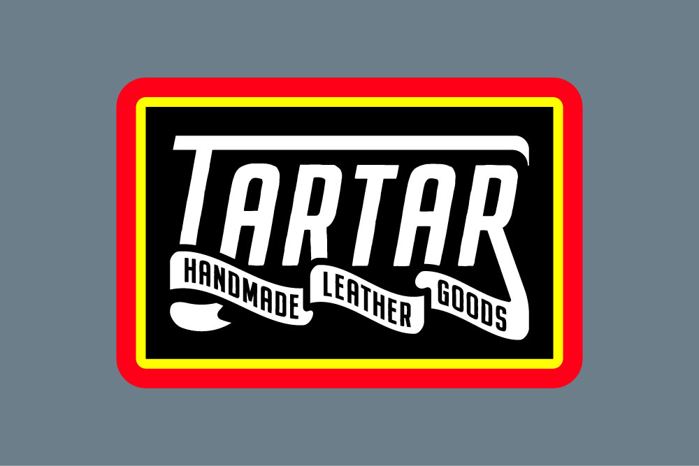
Before
The previous logo carried the right intention, but its fine lines limited its presence – especially in applications where strength, material, and longevity needed to be felt immediately.
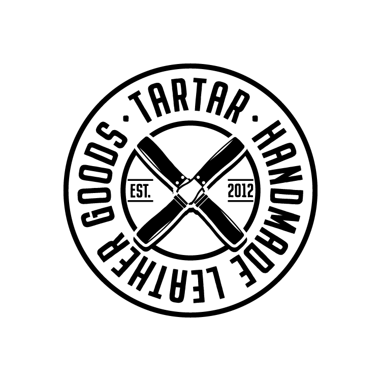
After
The new identity focuses on boldness and visibility. Stronger shapes, clearer contrast, and a mark that holds up across materials, scale, and real-world use.
The main mark is built around two crossed leather belts with aviation buckles, forming a propeller-like shape. Circular elements frame the logo, creating balance, structure, and a sense of precision – while still feeling crafted and material-driven.
The icon distills the identity down to its strongest element: the crossed belts.
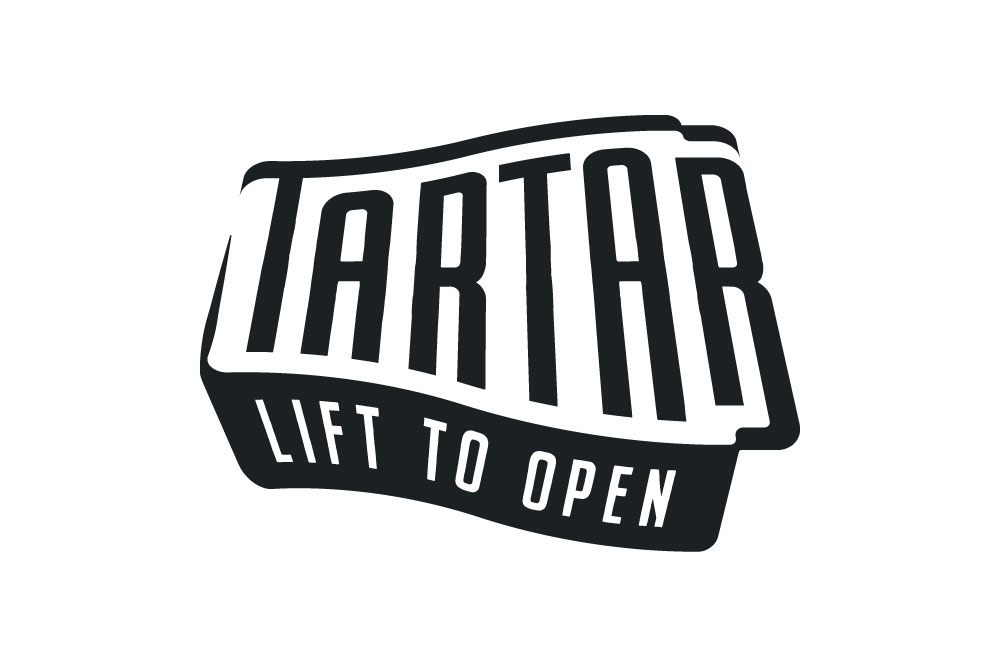
The wordmark introduces subtle motion through shear and rotation, referencing the moment of takeoff – adding energy without becoming decorative.
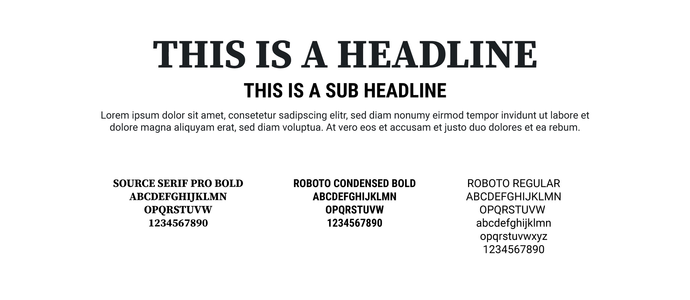
Typography
The typographic system balances character and clarity.
A serif headline type adds warmth and heritage, while condensed and neutral sans-serifs ensure readability, structure, and flexibility across applications.
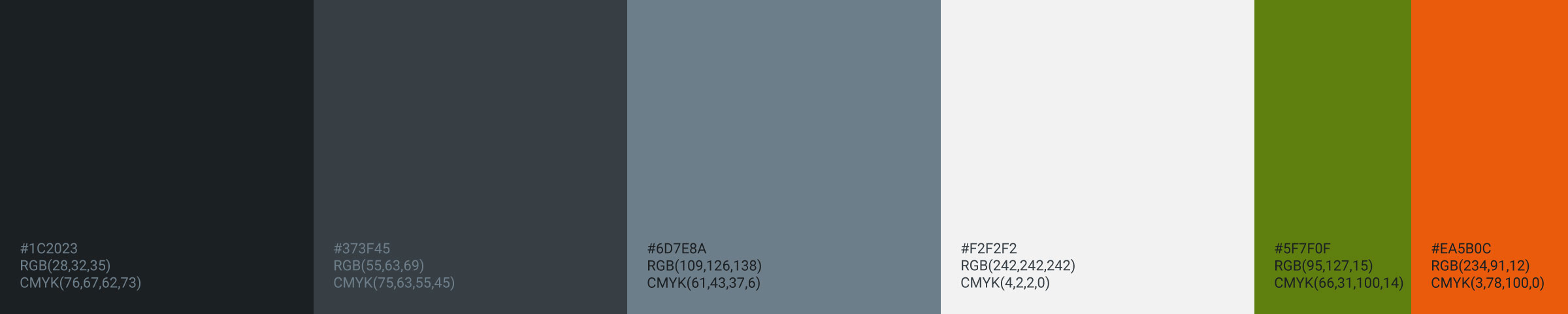
Color Palette
The color palette draws from industrial materials and aviation hardware — steel, graphite, and worn surfaces – paired with restrained accent colors to add contrast and energy where needed.
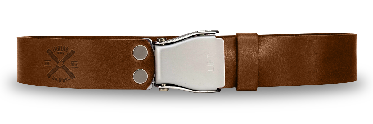
Product Mark & Leather Embossing
A simplified version of the mark was developed specifically for leather embossing. By removing outer elements and reducing complexity, the core of the logo could be scaled up to fit the limited space defined by the belt width.
This makes the central mark – the crossed belts and propeller form – more visible, bold, and legible, while keeping the identity recognizable even when pressed directly into material.
Badges & Supporting Graphics
Supporting badges extend the identity system without diluting it. They communicate trust, origin, and milestones – designed to integrate seamlessly into products, packaging, and communication.
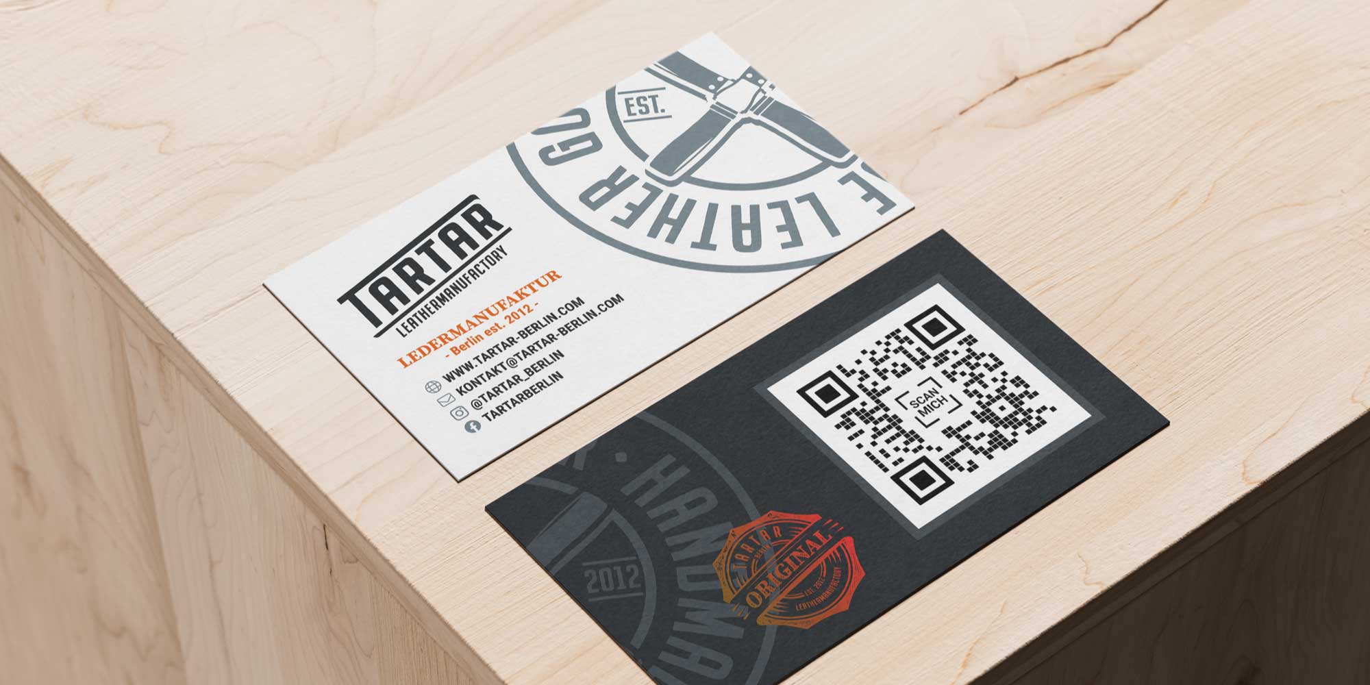
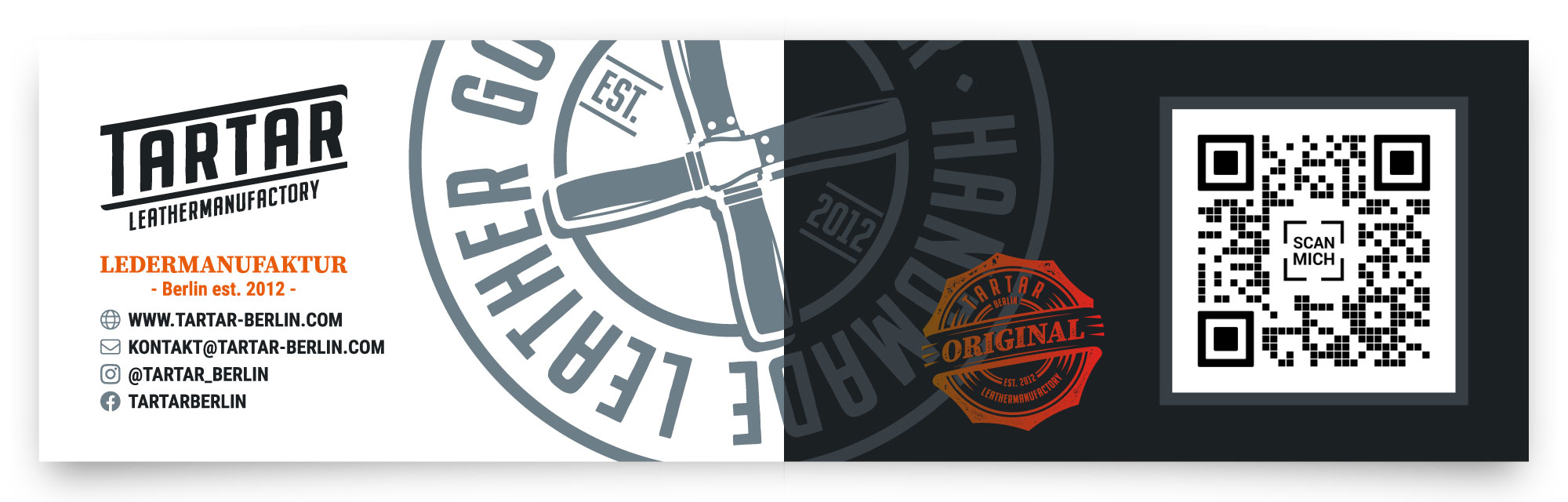
Applications
The visual identity was designed to work beyond the logo sheet – in real-world use, on products, and in everyday brand touchpoints.
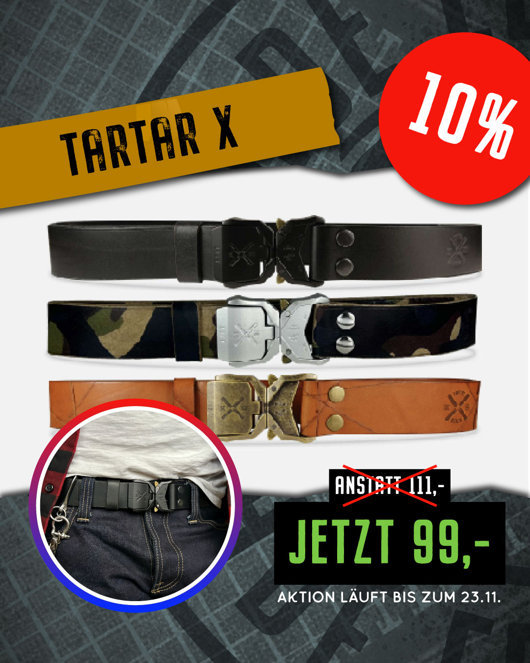
From business cards to market and tour vehicles, and workwear, the system stays consistent and recognizable. On the products themselves, the embossed mark respects the material while remaining bold and legible.
The goal was never to decorate surfaces, but to create a system that holds up in use – quietly confident, functional, and built to last.
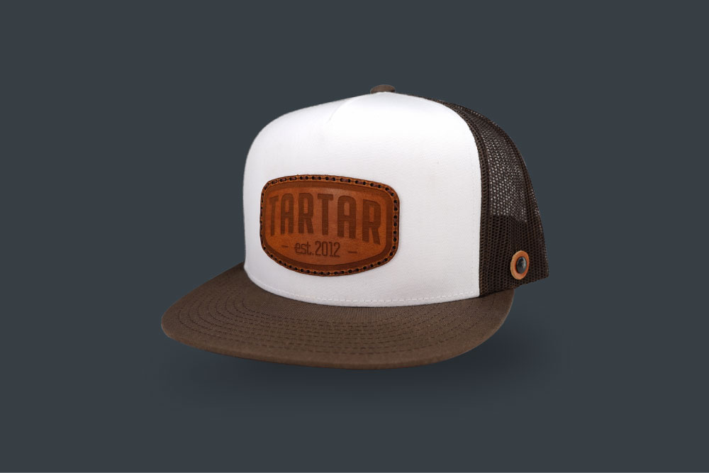
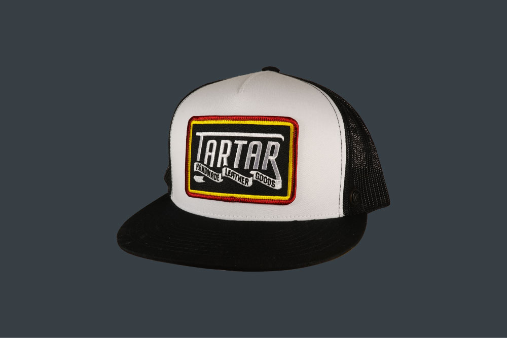
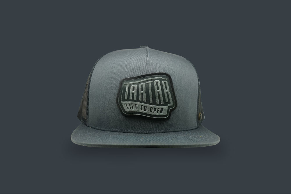
Brand Assets
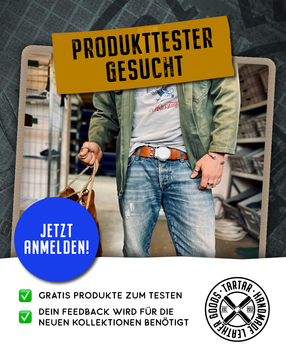
Beyond the core identity, a set of brand assets was developed to extend the brand into products and apparel – without relying solely on the main logo.
These assets focus on character, message, and wearability. They allow the brand to show up in a more relaxed, expressive way, while still staying rooted in the overall system.
This approach makes the brand flexible: strong enough to stand without constant logo use, and recognizable even when the mark takes a step back.
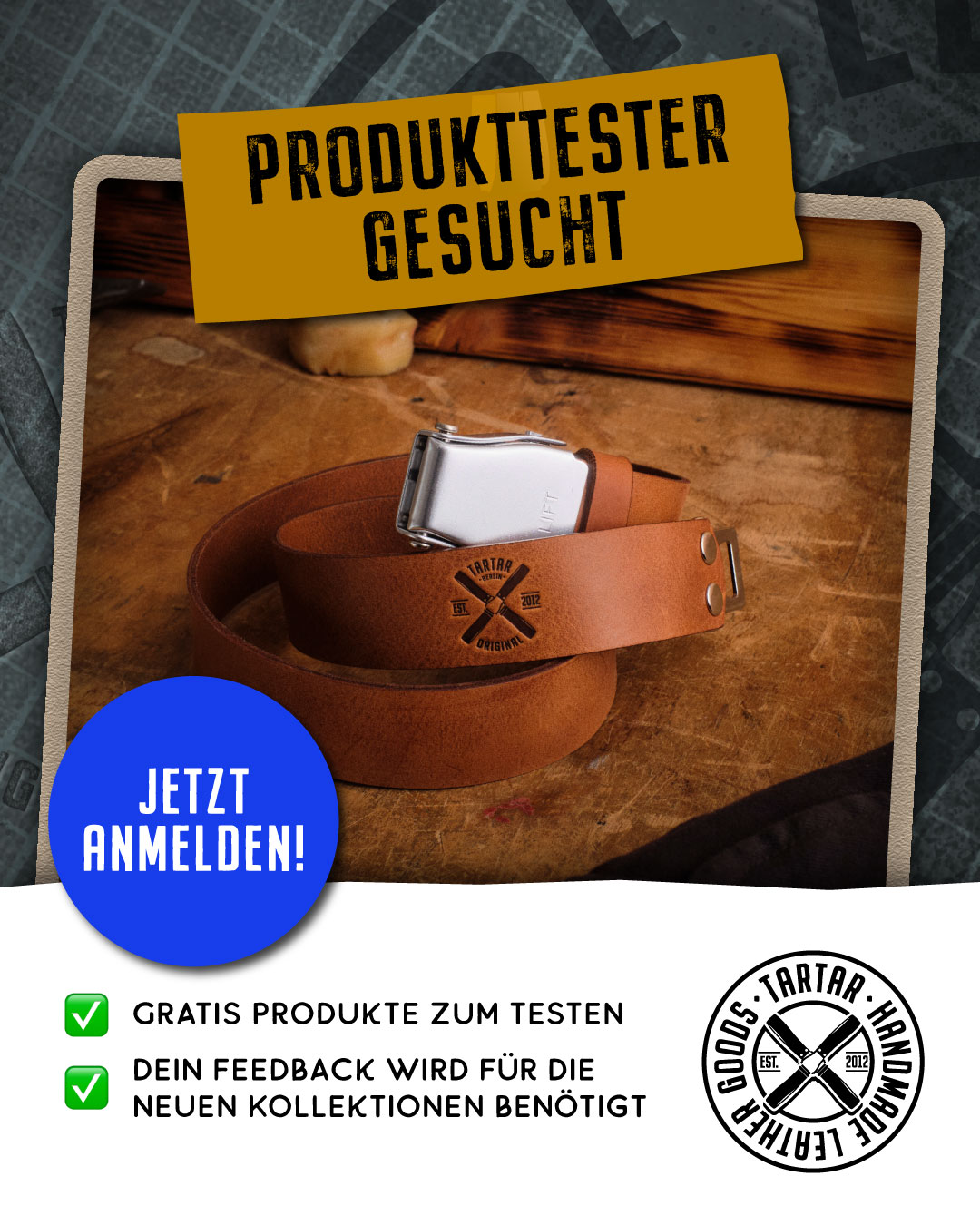
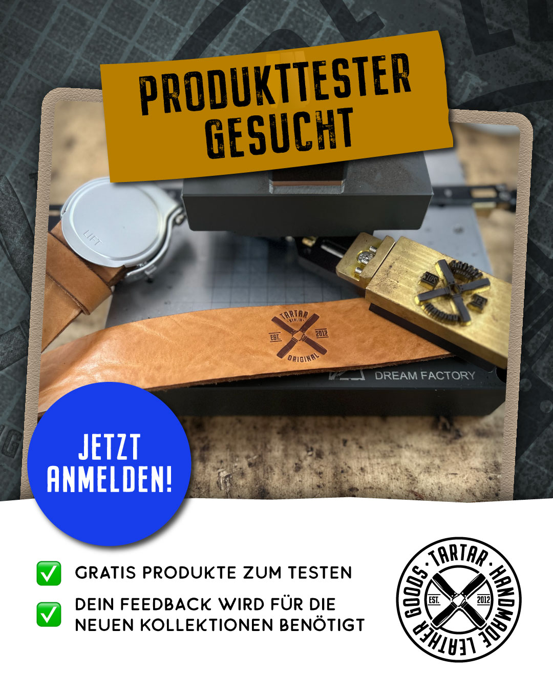
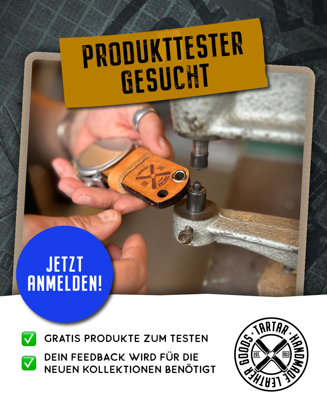
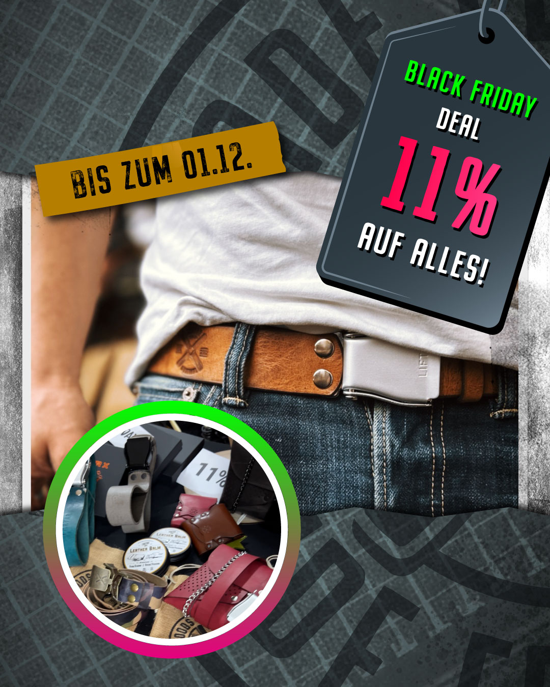
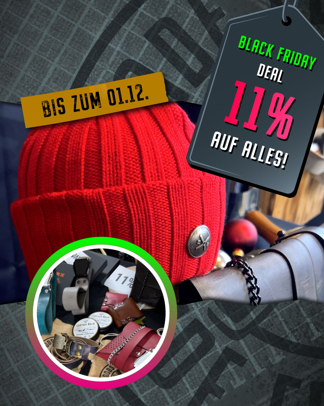
Content (Shortform & Social)
tartar_berlin
tartar_berlin
tartar_berlin
Shortform content became a natural extension of the brand system. The focus wasn’t on trends or volume, but on translating material, process, and attitude into motion – keeping the same visual language, clarity, and restraint.
Static posts and carousels complement the videos, adding structure and rhythm while reinforcing the brand across social touchpoints. Content wasn’t treated as a separate discipline – it grew directly out of the design system.
“Manuel understands our craft and translates it into a visual language that feels authentic and strong. The identity works effortlessly across products and communication.”