A culture-driven streetwear brand built as a creative system.
Washed Bros. is a Berlin-based streetwear label developed from concept to launch as a fully structured brand world.
From naming and positioning to identity system, visual language, and launch drop, the project was built as an independent culture brand – not just a logo.
The Concept - The Laundry Service
Washed Bros. was built around a central idea: treating a streetwear brand as a system rather than a series of drops. The “Laundry Service” became the conceptual backbone of the project. Laundry represents process. Repetition. Reset. Refinement.
Instead of releasing isolated collections, the brand operates in structured “Spin Cycles” – chapters that reinterpret the brand world through new visuals and moods while remaining anchored in the same framework. This approach allows the brand to evolve without losing coherence. Every idea runs through the same system before becoming part of the identity.
Scope: Brand Strategy & Concept Development Brand Identity System Creative Direction Launch Drop Development
Deliverables: Logo System (Icon, Wordmark, Badge, Lockups) Color Palette & Typography Graphic Patterns Brand Framework (Laundry Service / Spin Cycles) Launch Collection (Spin Cycle 01) E-Commerce & Visual Rollout
Role: Founder & Creative Direction
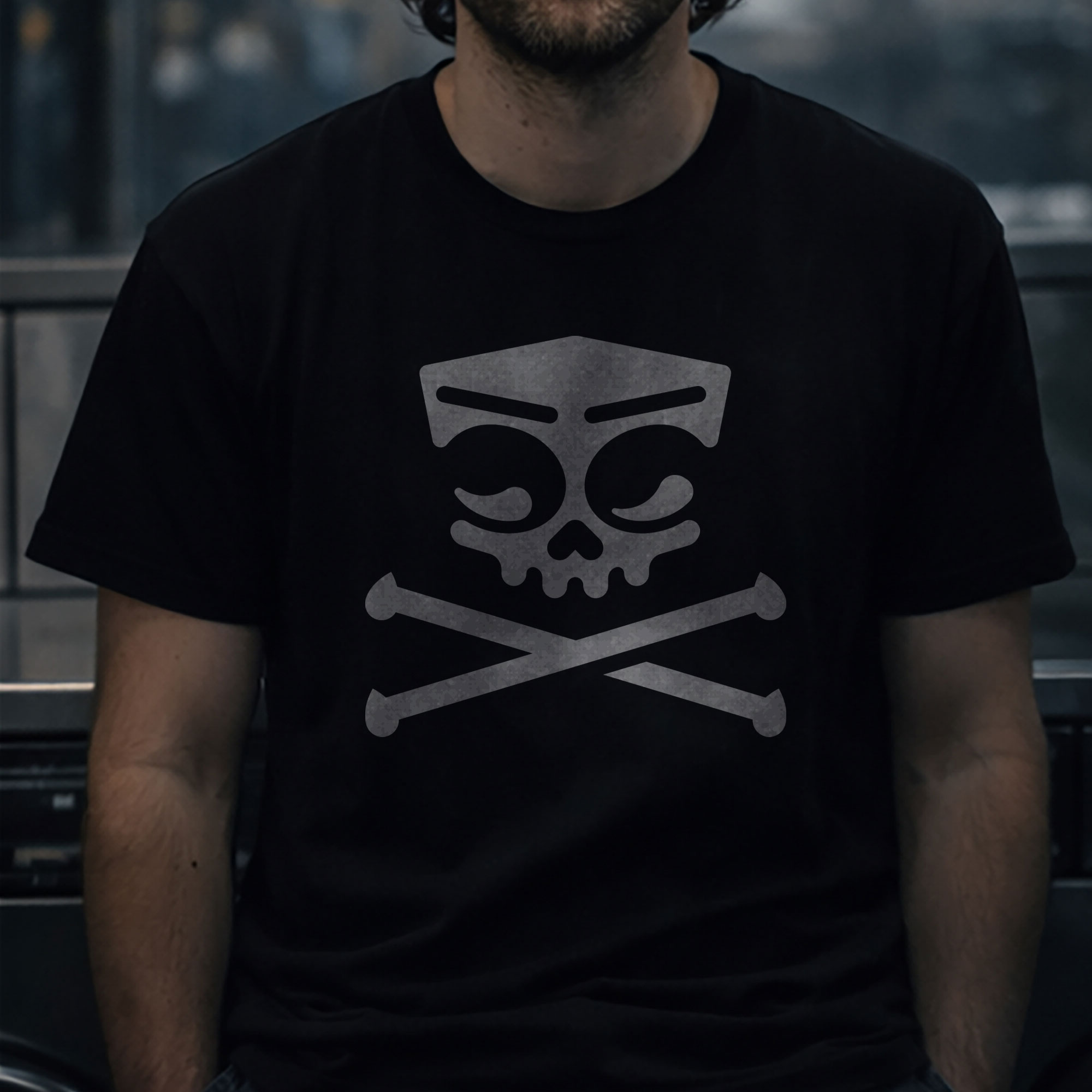
The Mark - A Symbol Built from Contrast
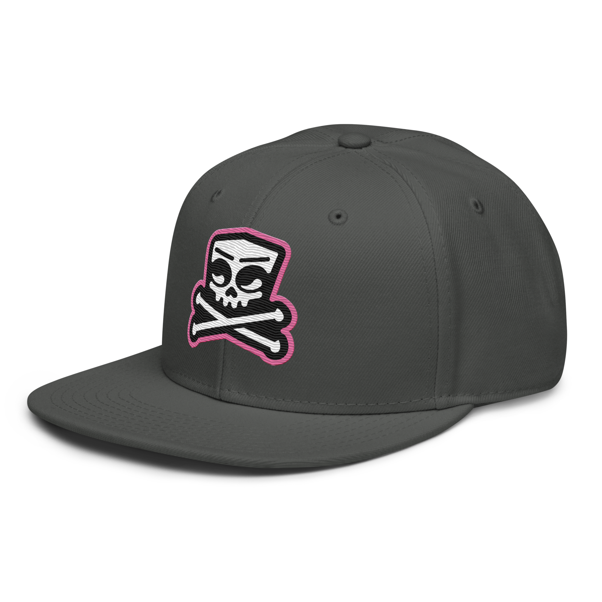
At the core of Washed Bros. sits a custom-built symbol. The icon merges two washing machines into a single form – creating a skull through negative space and symmetry.
The circular doors become half-filled water chambers, forming heavy, “washed” eyes. The upper jaw of the skull is subtly constructed through droplet forms, while the lower jaw is intentionally omitted to keep the mark reduced and graphic. Below, crossbones extend into water droplets, reinforcing the laundry metaphor without becoming illustrative or playful.
It is not just a skull. It is a constructed symbol built from functional elements. Below is a breakdown of how the form comes together.
Logo System - Built on Structure
The identity extends from the core icon into a strictly grid-based logo system. Every lockup was constructed with mathematical balance in mind – consistent spacing, proportional relationships, and controlled alignment between symbol and typography. Nothing is placed intuitively. Everything is measured.
Horizontal Lockup
The primary configuration places the icon on the left, with WASHED BROS. set in uppercase and stacked on the right. This format is optimized for headers, digital applications, and wider compositions.
Stacked Lockup
The vertical version centers the icon above the wordmark, creating a compact, balanced composition for square formats and apparel placements.
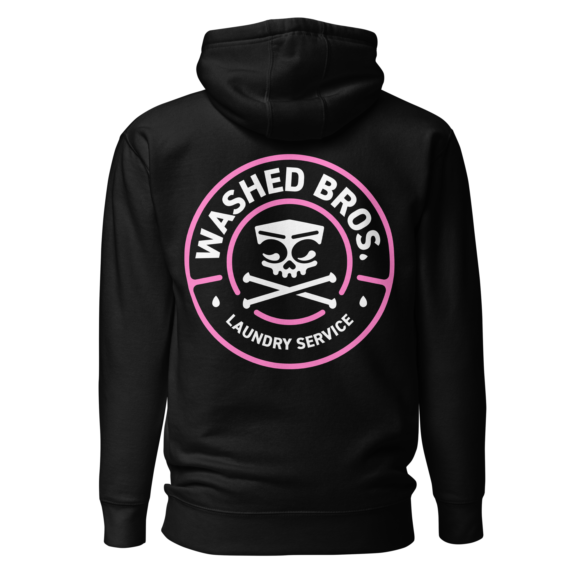
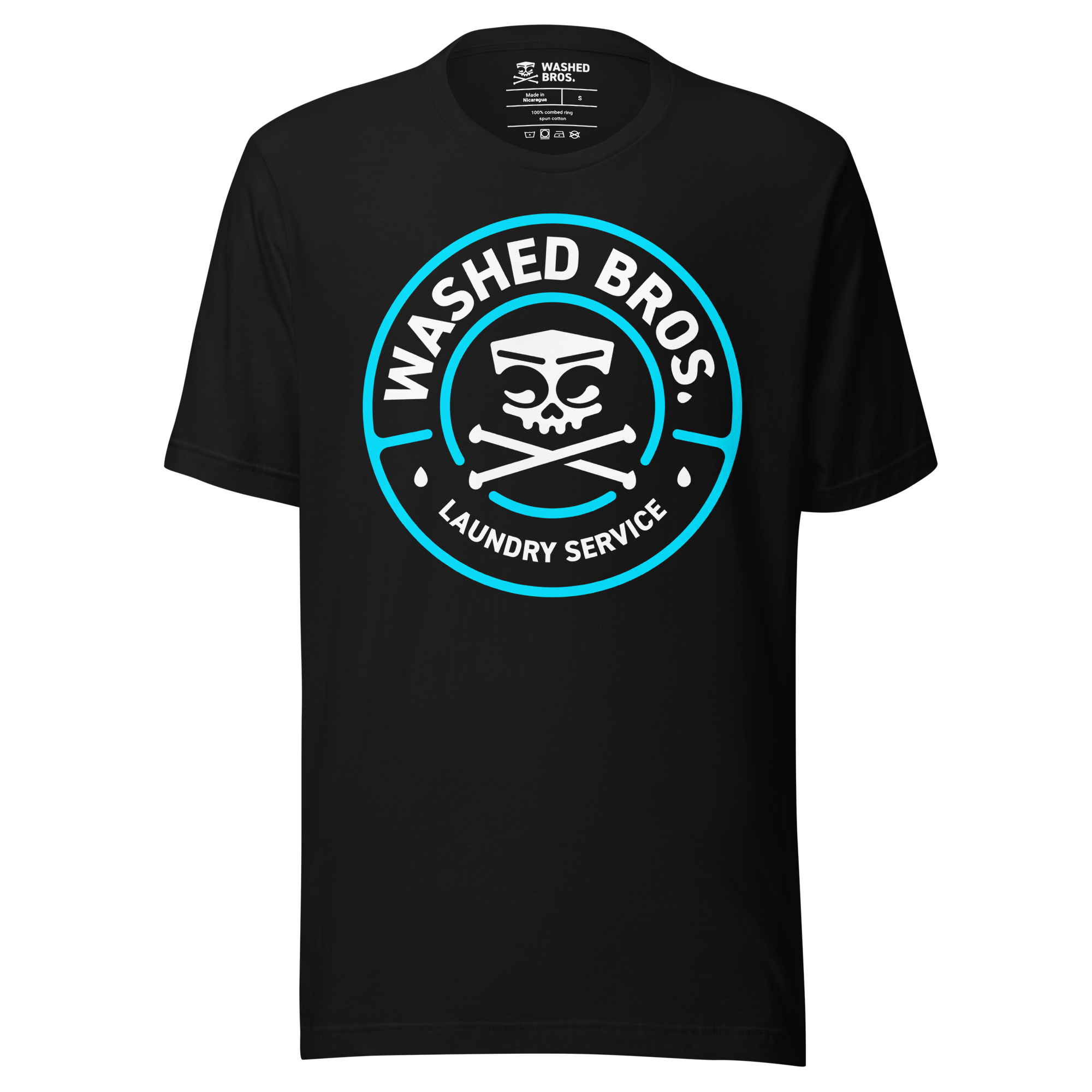
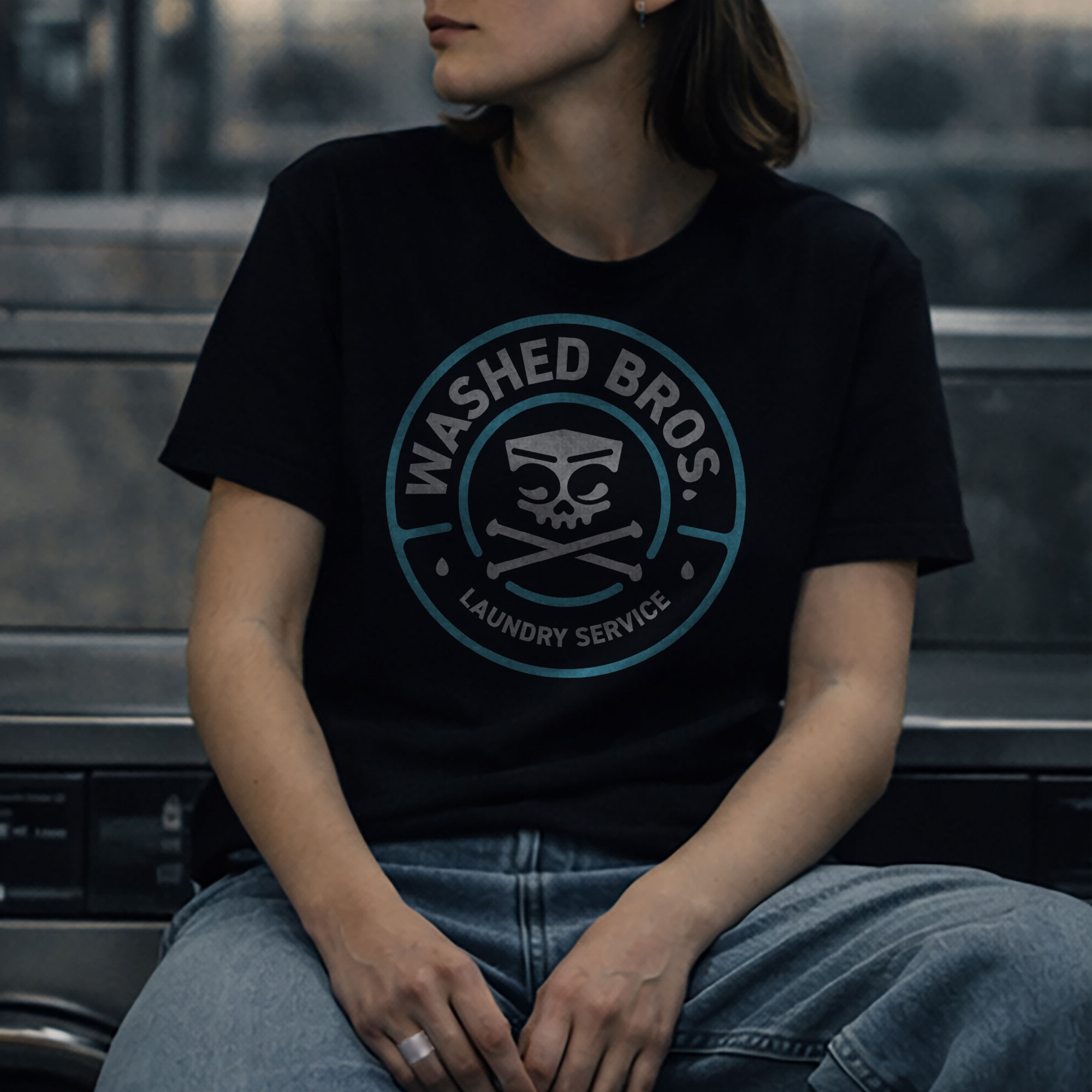
Badge Version
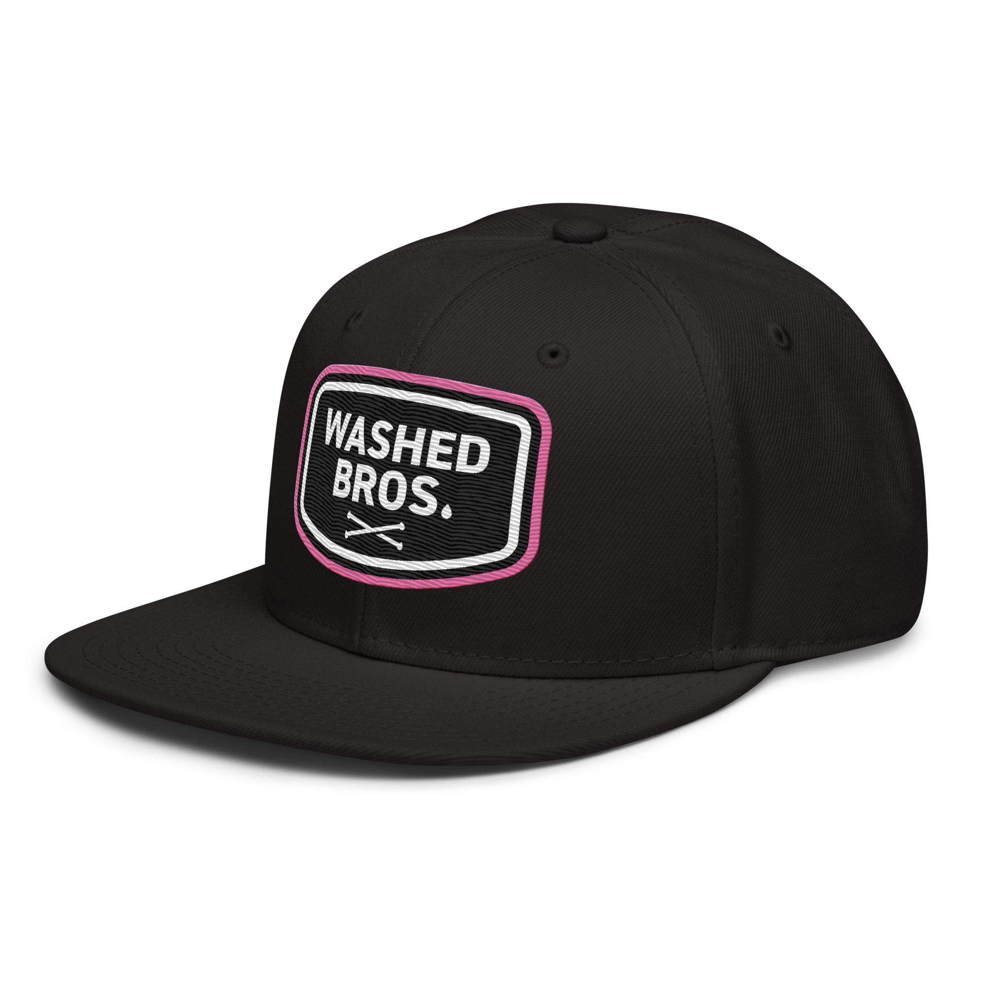
For circular applications, a badge lockup was developed.
“WASHED BROS.” runs along the upper text path, while “Laundry Service” anchors the lower arc in smaller type.
A double-circle construction frames the composition, reinforcing structure and cohesion.
Wordmark
The standalone wordmark exists both in a clean stacked version and in a patch-shaped variation designed specifically for textile applications.
The period following “Bros” is replaced by a droplet – a subtle detail that connects the typography back to the icon and reinforces the system logic across all lockups.
Across all versions, the grid remains consistent.
Spacing, alignment, and proportions follow the same structural logic.
The result is a flexible yet controlled system – adaptable without losing coherence.
Visual Language - Controlled Contrast
The visual language of Washed Bros. is built on restraint and contrast. The foundation remains monochrome – an off-white mark on deep black. This ensures maximum clarity, strong silhouette, and consistency across digital and textile applications.
Accent colors are introduced with intention. Bubblegum pink functions as the primary accent – slightly synthetic and referencing detergent packaging and artificial freshness. From this base, a controlled triad extends into a technical blue-green and acid yellow. The blue-green recalls washing machine displays and digital control panels, while the yellow adds high-contrast clarity where needed.
The palette supports the Laundry Service concept without overpowering the monochrome core of the identity.
Typography
The logo is set in DIN 2014 – a typeface associated with industrial signage and technical instruction systems. Its functional character aligns with the machinery-inspired concept and reinforces the structured nature of the brand.
For digital applications and the e-commerce system, Sofia Sans is used across multiple weights, including a condensed extra-bold for headlines.
This separation ensures clarity in interface contexts while keeping the logo typography distinct and iconic. The result is a typographic system that balances industrial precision with contemporary digital usability.
SOFIA SANS CONDENSED EXTRABOLD UPPERCASE FOR HEADLINES
ABCDEFGHIJKL MNOPQRSTUVW
XYZ
SOFIA SANS FOR BODY TEXT
ABCDEFGHIJKL MNOPQRSTUVW
XYZ
abcdefghijkl mnopqrstuvw
xyz
The Spin Cycle Framework
Instead of traditional product drops, Washed Bros. operates in structured “Spin Cycles.”
A Spin Cycle is not just a release – it is a controlled chapter within the brand system. Each cycle introduces new visuals and reinterpretations of core symbols while remaining anchored in the same structural framework. This allows variation without fragmentation.
The Laundry Service concept acts as the regulating mechanism. Ideas are refined, filtered, and reintroduced through cycles – creating continuity rather than noise. The system ensures that growth feels intentional. Evolution without losing identity.
FRESH LAUNDRY. ALWAYS.
Washed Bros. is the uniform of the spun underground. Spinwear with attitude. Designed in Berlin. Clean looks. Dirty minds.
Spin Cycle 01 - Establishing the System
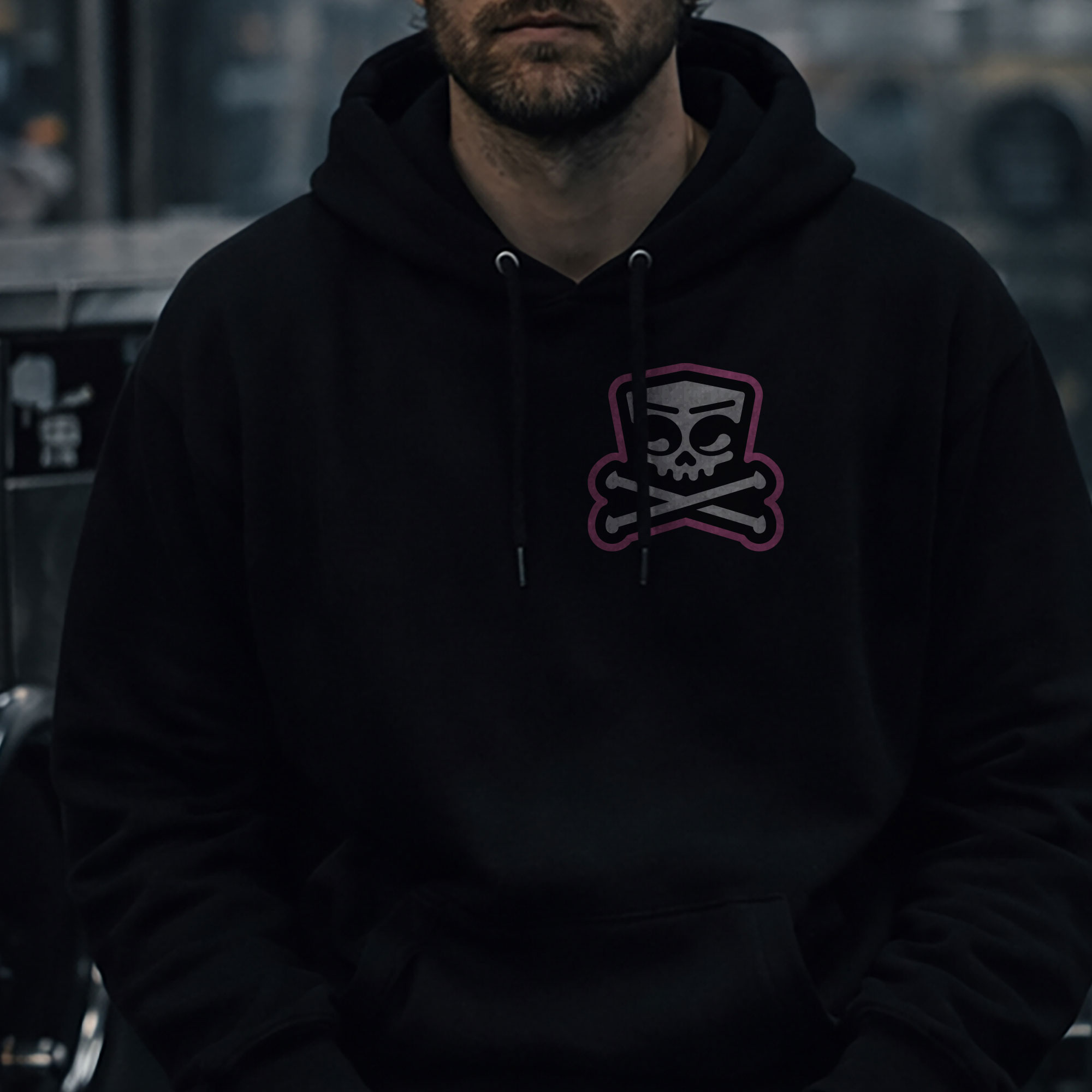
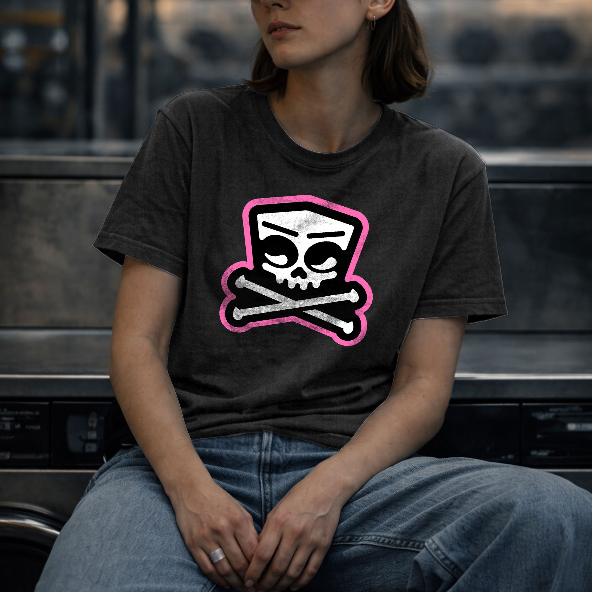
The first Spin Cycle was intentionally reduced. Instead of introducing complex graphics or narrative expansions, the launch focused entirely on the logo system itself. The badge, stacked lockup, icon-only version, and wordmark patch were applied across hoodies, T-shirts, and caps – establishing recognition before variation.
This approach positioned the identity as the primary statement. No distractions. No secondary visuals. Just the core mark in different contexts.
The visual rollout included a laundromat-based video loop – reinforcing the Spin Cycle concept through motion rather than explanation.
Future cycles are designed to expand the system – introducing new graphics and layered storytelling while remaining anchored in the original structure.
Applications - From System to Surface
The identity was designed to function across both digital and physical environments. On apparel, the system translates into clear, scalable applications – bold back prints, centered chest placements, and subtle logo patches.
The badge version operates as a strong statement piece. The stacked lockup creates vertical balance on hoodies. The icon functions independently as a reduced, recognizable mark. The wordmark patch introduces a tactile layer for textile integration.
All applications follow the same structural logic defined in the identity system – consistent spacing, controlled placement, and high contrast.
Shot in a laundromat setting, the lifestyle material reinforces the brand world without over-staging it. Concrete surfaces, machines, waiting spaces – the identity remains graphic and controlled within raw surroundings.
The result is a brand that feels cohesive – whether viewed on screen, on fabric, or in motion.
Closing
Washed Bros. was developed as a structured brand system – not as a seasonal trend project. From the initial concept of the Laundry Service to the construction of the logo architecture and the rollout of Spin Cycle 01, every element follows the same underlying logic: clarity, repetition, and controlled contrast.
The project demonstrates how identity can extend beyond a logo – becoming a framework that guides visuals, products, and future growth.
Not built to chase trends. Built to run cycles.
Washed Bros. is an independent brand founded and developed by myself as an ongoing project.